
Blog #5: Turn Text Blocks Into Fast Visuals
“Design is not just what it looks like. Design is how it works.” — Steve Jobs
Introduction
Ever sat through a presentation where every slide was a wall of text? Most clinicians have. We’ve all squinted at dense paragraphs, searching for meaning. It’s not a lack of intelligence—it’s a failure of formatting.
Cognitive load theory tells us that visual working memory is separate from verbal memory. Overloading one channel—especially with paragraph-heavy slides—leads to distraction, not retention.
At SlidesRx, we believe your content should speak at a glance. That means trading text blocks for clean visuals that drive the point home. In this post, we’ll show you how to recognize text-heavy slides, choose the right visual replacement, and build message-first graphics that do more with less.
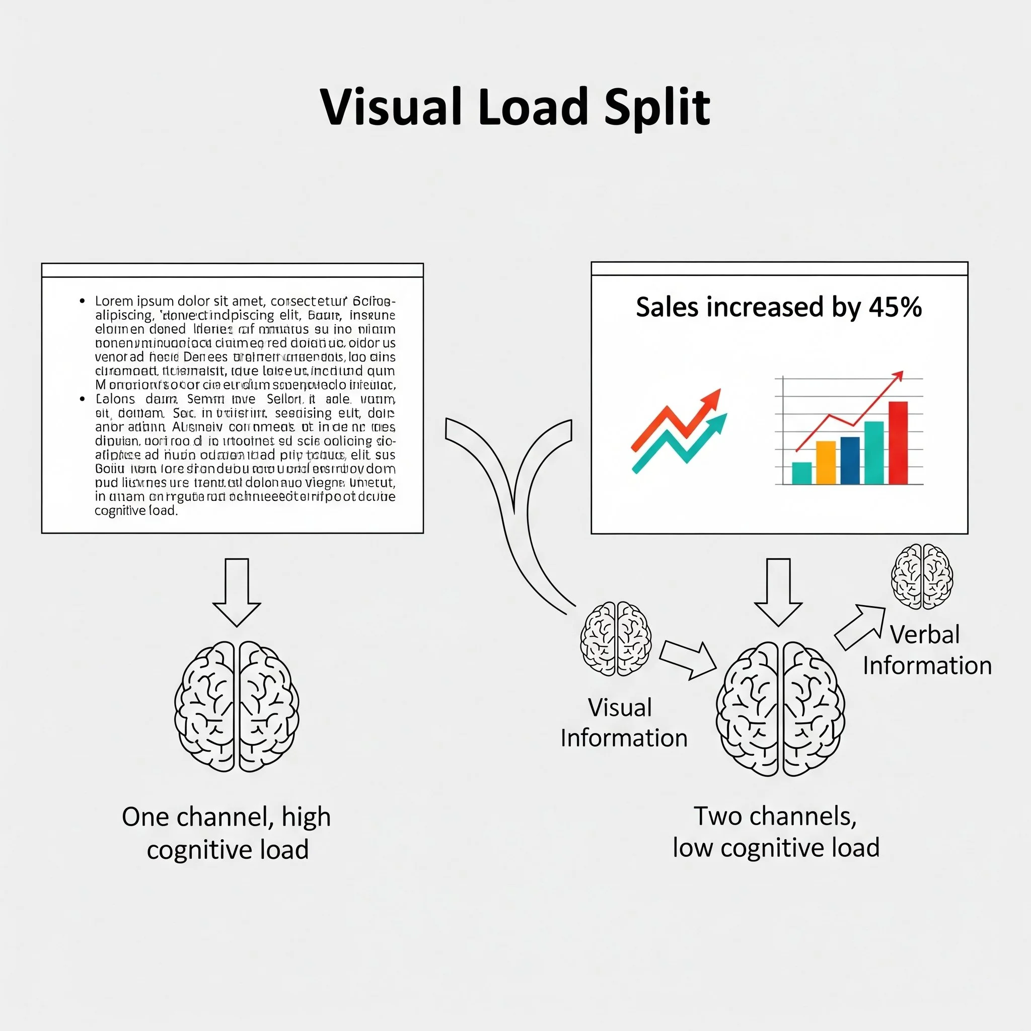
Split-channel cognitive load visual
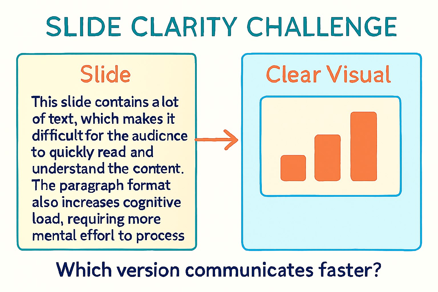
🧱 Why Paragraphs Don't Work on Slides
A slide filled with text isn’t a slide—it’s a document. And documents aren’t designed to be read aloud while someone talks. They split attention and crush retention.
Cognitive studies consistently show that simultaneous reading and listening compete for mental bandwidth. When your slide has a paragraph and your voice says something different, your audience has to choose. Most will try to do both and retain neither.
This is especially harmful in medical presentations, where dense text often includes complex terminology, statistics, or long lists. In clinical settings, even small distractions can derail understanding.
Your audience shouldn’t need to pause and decode. The best slides support the story—not compete with it. If it takes more than 5 seconds to read, it probably doesn’t belong on the screen.
Think of slides as signposts, not scripts. They're there to anchor your voice, not replicate it. Want to explain a protocol? Show a flowchart. Need to compare rates? Use a bar chart. The less they read, the more they hear.
🎨 Match the Message to the Medium
Not every visual is the right visual. Swapping a paragraph for a blurry stock photo or cluttered chart isn’t an upgrade—it’s just a new form of noise.
The SlidesRx method starts with a message type. Is your slide about a process? Use a flowchart. Comparing outcomes? Bar chart or table. Showing progression? Timeline or staircase.
Every message has a best-fit visual format. Once you know your point, pick the shape that fits. This makes your slide not just prettier—but *clearer*.
For example: Instead of listing discharge criteria in a paragraph, turn it into a checklist with icons. Instead of describing pre/post-intervention results, show them side-by-side in a dot plot.
Remember: visuals are only helpful when they reduce cognitive effort. Decorative images and filler icons increase clutter without adding clarity. If it doesn’t help the message, it doesn’t belong.
When in doubt, ask: does this visual replace or reinforce text? If neither, it’s not the right format.
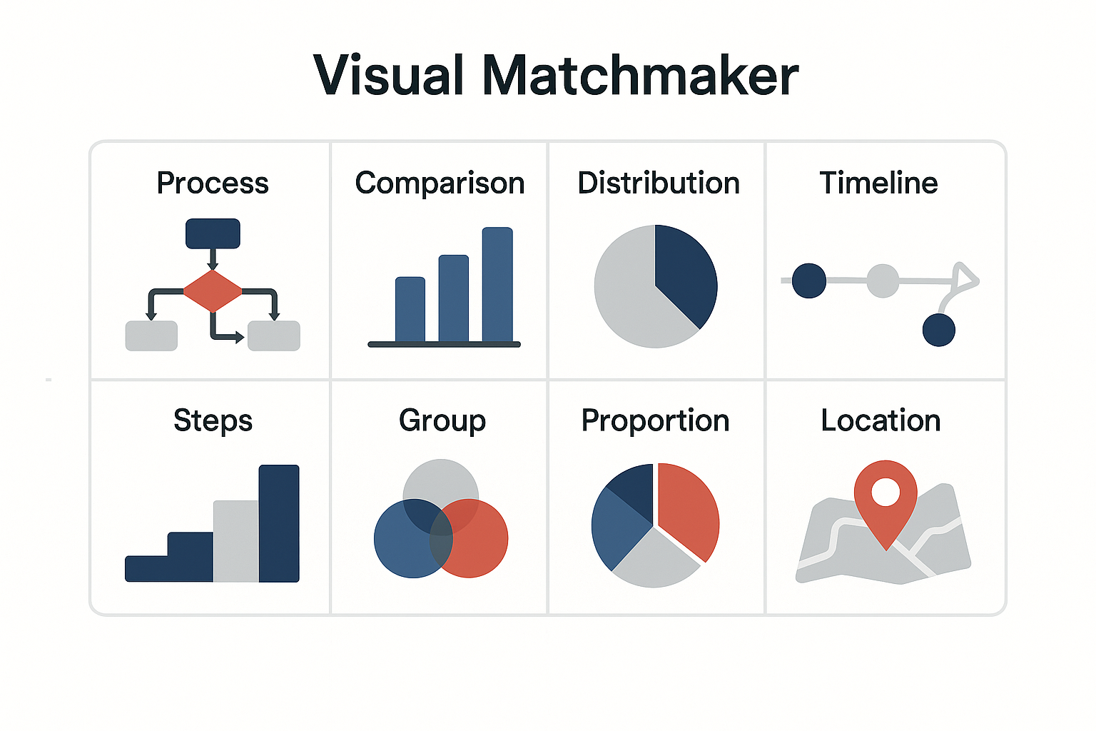
Visual tool selector grid
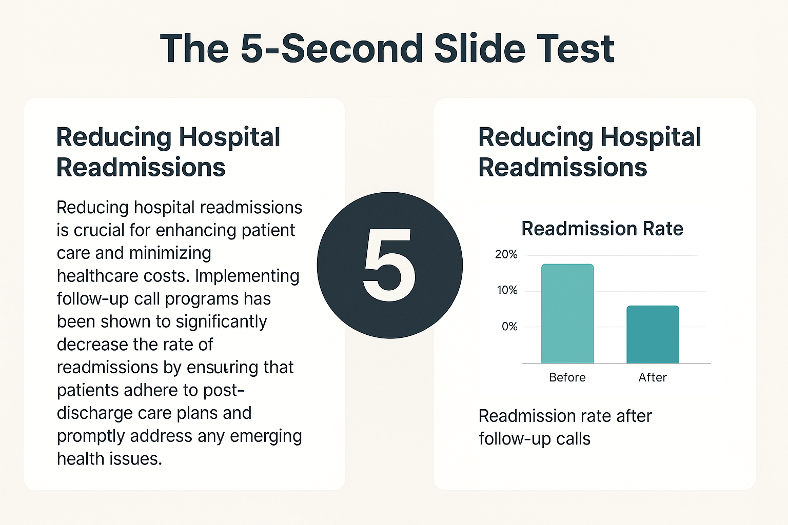
🧪 Test Your Slide With the 5-Second Rule
Here’s a simple test: put your slide on screen, then take it down after 5 seconds. What do people remember? If they can’t summarize the point, it’s too dense.
Effective slides communicate in a glance. Just like a good infographic or chart, your audience should understand the gist without reading a paragraph.
We use the 5-Second Rule at SlidesRx to pressure-test every layout. If the message isn’t obvious in five seconds, we simplify again—fewer words, bigger visuals, bolder titles.
Want to test your own? Show a colleague a slide for 5 seconds. Ask: What did you see? What did it say? What do you remember? If they hesitate or guess, revise.
Bonus: This rule also boosts accessibility. Clearer layouts help viewers with dyslexia, low vision, or those reviewing slides after the talk. Fast clarity = better equity.
The fastest fix? Replace the paragraph with a simple visual + headline takeaway. Think of it like rewriting a discharge summary: clear, concise, and useful.
Timer test for slide clarity
⚡ Quick Takeaways
• Paragraphs don’t belong on slides—turn them into visuals.
• The brain can’t listen and read dense text at the same time.
• Match message types to the best visual format (e.g., flowcharts, charts, icons).
• Use the 5-second test to check if your slide communicates quickly.
• Clean visuals improve attention, retention, and accessibility.
• If it doesn’t teach or clarify, it doesn’t belong on the slide.
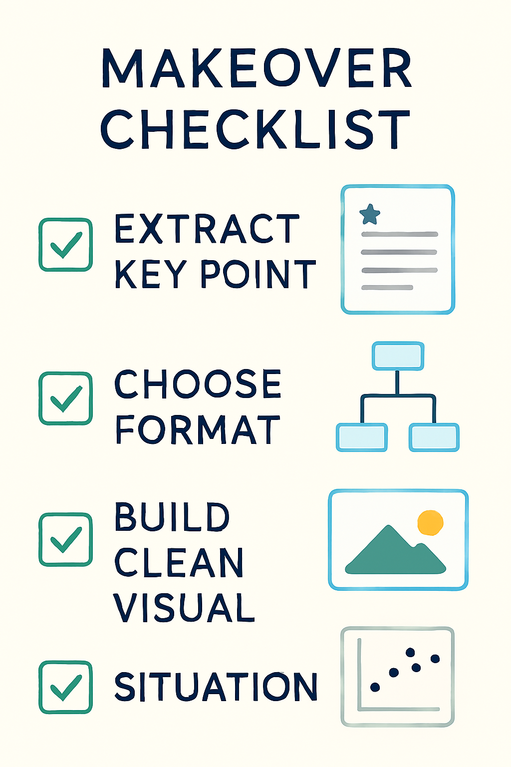
Visual rewrite flow
✅ Conclusion
Clinical slides should communicate at a glance.
When you swap blocks of text for clear visuals, you reduce cognitive load and boost retention.
Less text doesn’t mean less substance—it means smarter communication.
🎯 Challenge
Take one of your recent text-heavy slides and run the 5-second test.
Then, rebuild it using a clean visual: a chart, image, or icon-supported layout.
Post the before/after with #SlidesRx—tag us and inspire someone else to simplify.
🔜 Next Week Preview
Next week, we’ll tackle contrast.
You’ll learn how background and text color can make or break readability—and how to spot common contrast mistakes.
💬 Call to Action
Seen a slide packed with paragraphs?
We want to help transform it.
Send it to us or tag it with #SlidesRx—and we’ll show how to make it clear, visual, and fast.
What’s the most overloaded slide you’ve seen lately?