SlidesRx Blog #6 – Ensure High Contrast for Slide Readability
“Clarity emerges when contrast is clear.” – Adapted from Edward Tufte
Introduction
Imagine standing in a dim conference room squinting at a slide—reading gray text on a light background—or worse, reversed color schemes. Research shows that even moderately low vision or color‑vision deficiencies affect millions, making poor-contrast text hard or impossible to read. WCAG standards require a minimum contrast ratio of 4.5:1 for normal text, and 3:1 for large/bold text to ensure legibility. In clinical settings, slide clarity isn’t just aesthetic—it supports comprehension, safety, and trust.
SlidesRx frames contrast as a clinical communication tool: high contrast = high credibility. In this post, you'll learn:
- Why contrast is especially vital in medical presentations
- Common missteps and how to fix them
- A clear checklist‑based process to audit and apply contrast effectively
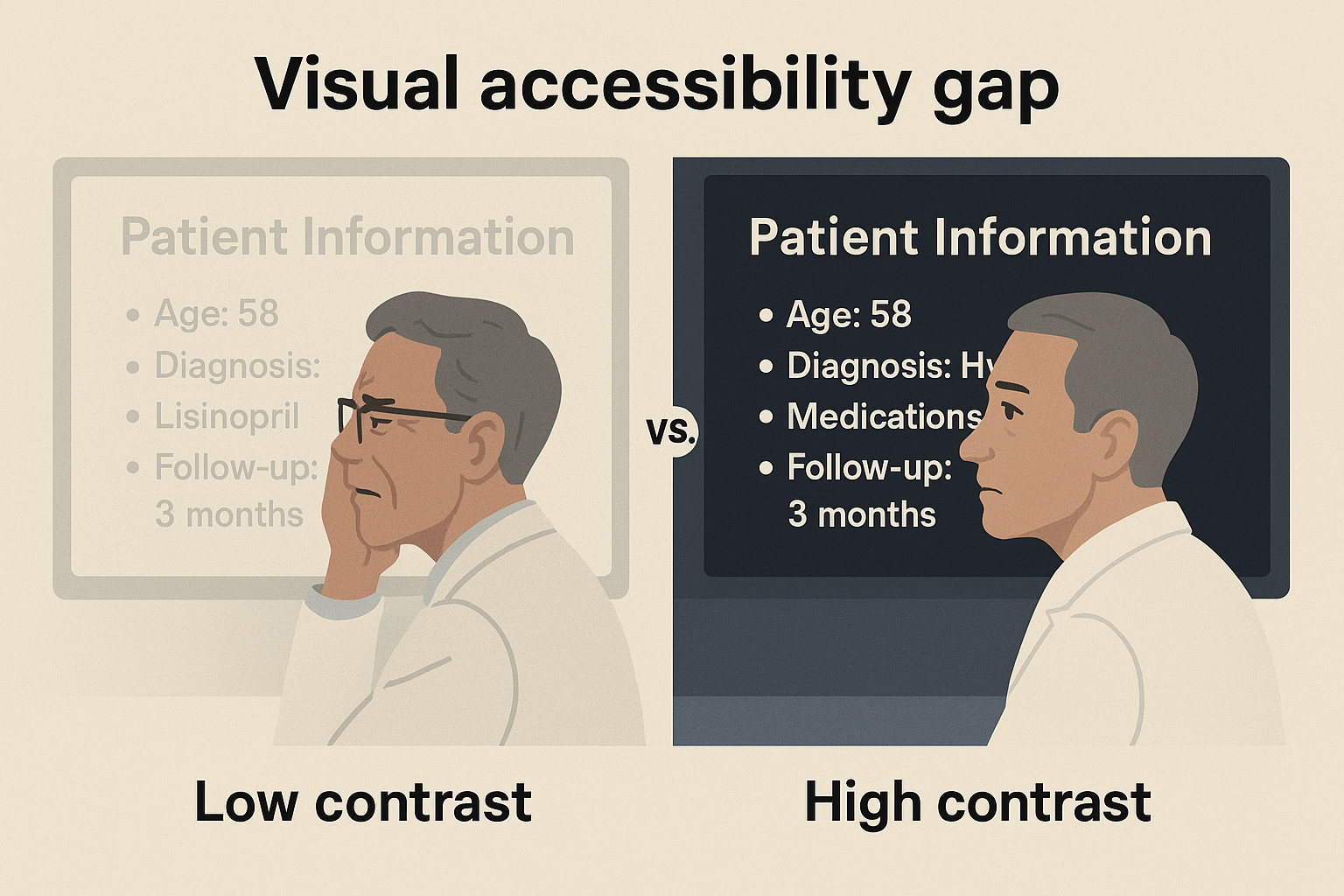
Clinician struggling with low contrast
🧲 Why High Contrast Matters in Clinical Presentations
Many generic slide design guides mention “contrast,” but they rarely cite empirical standards. In contrast, the Web Content Accessibility Guidelines (WCAG 2.1 AA) define specific numeric thresholds—text must have a contrast ratio of at least 4.5:1, unless it’s bold or large text, where 3:1 is allowed. Tools like WebAIM’s Contrast Checker or BrightSlide help you measure actual slide color combinations.
In healthcare, inadequate contrast can cloud critical data—in clinical charts, axis labels, or warning messages. Without strong contrast, even bold titles become invisible or distracting under fluorescent lighting or in older projection systems. SlidesRx emphasizes contrast not as tweak—it’s a clinical imperative: slides should support reading of lab values and decision prompts without strain.
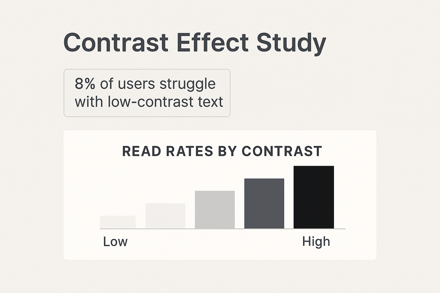
Readability drop with low contrast
🔍 Common Missteps & How to Fix Them
One common error is using light gray text on white (e.g. #777777), which often falls below the 4.5:1 threshold even though it feels readable. Similarly, using pure green text (RGB 0,255,0) on white has a ratio of only ~1.4:1—clearly unreadable. In fact, pure blue on white scores ~8.6:1 and passes easily.
SlidesRx avoids guesswork: use the SlidesRx palette (Soft Navy, Charcoal, Sky Blue) which are built with WCAG contrast in mind. Always avoid red/green combos that fail color‑blind tests; data colormaps should be CVD‑safe (e.g. cividis style).
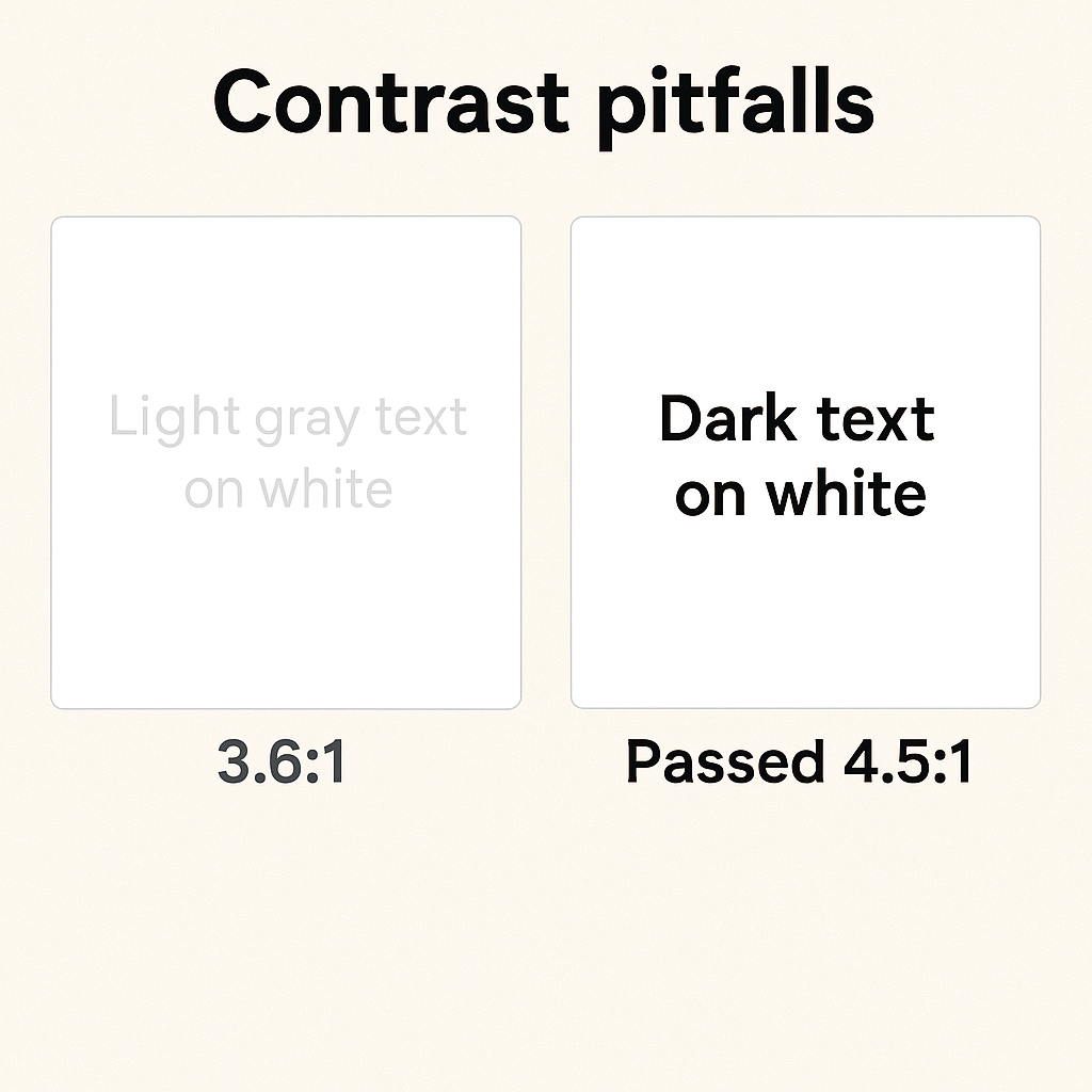
Contrast errors comparison
✅ How to Audit & Apply Contrast in Your Slides
Start with the SlidesRx Checklist: under “Clean Visuals,” verify every text block and chart label meets contrast standards. Then run a contrast checker (WebAIM or BrightSlide) across all foreground/background pairs. For graphical objects and essential icons, aim for at least 3:1 contrast per WCAG non‑text criterion.
Process:
1. Export your slides to image mode and run them through a contrast tool.
2. Increase font sizes or switch to bolded color-safe text if ratios fall below thresholds.
3. Replace low-contrast visuals with SlidesRx-approved palette versions.
4. Peer-review at stringency: view in grayscale mode or project at distance.
This ties directly into SlidesRx principles: one idea per slide, visual hierarchy, clean visuals = readable, clinical slides.
Grayscale readability check
Quick Takeaways
- Always meet 4.5:1 ratio for regular text; 3:1 if large or bold
- Use SlideRx-approved palette (Soft Navy, Charcoal, etc.)
- Run a contrast checker tool before finalizing
- Review slides in grayscale or color-blind simulation
- Apply 3:1 contrast rule to icons/chart elements
- Avoid gray on white, pale green, low‑contrast fills
- Use SlidesRx checklist during design review
Conclusion
High contrast isn’t optional—it’s essential. Legible slides support medical communication, reduce interpretation errors, and uphold credibility. By integrating SlidesRx contrast standards into your workflow, you elevate every presentation into clear and clinical clarity.
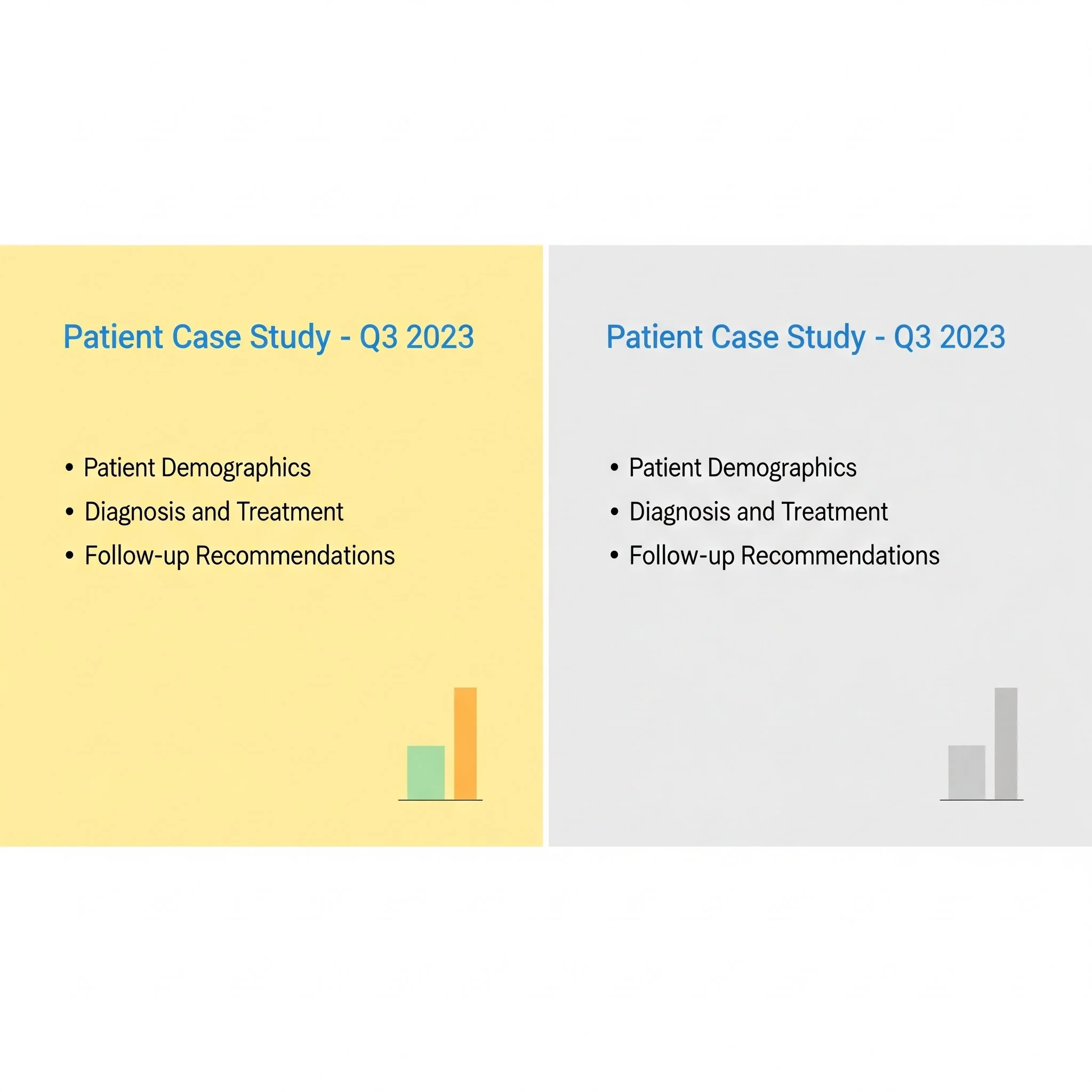
Challenge
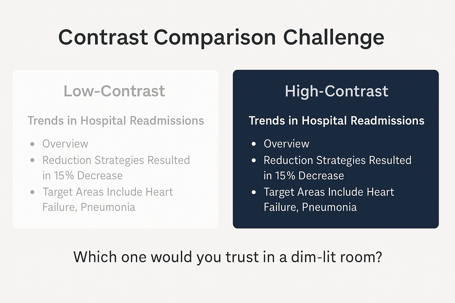
Pick the legible slide
Next Week Preview
Next week, we’ll cover “Label all axes, units, and visuals clearly.” Because readability goes beyond contrast—precision matters too.
Call to Action
What’s the lowest-contrast slide in your current deck? Try switching it to a SlidesRx-approved palette and rerun your contrast checker. Then come back and share the before/after with us—what changed in readability for you?