
Blog #7: Make It Obvious – Label Everything
"Design is the silent ambassador of your brand." – Paul Rand
Introduction
Ever stared at a chart and asked, 'What am I looking at?' You're not alone. Even experienced audiences struggle when axes aren’t labeled, units are missing, or visuals assume too much. In clinical communication, every detail matters—especially the ones we forget to explain.
Clear visuals aren't just about aesthetics—they’re about accuracy and credibility. If a viewer has to guess what a chart means, we’ve already lost clarity. That’s why labeling every axis, title, and annotation isn’t just a best practice—it’s a clinical necessity.
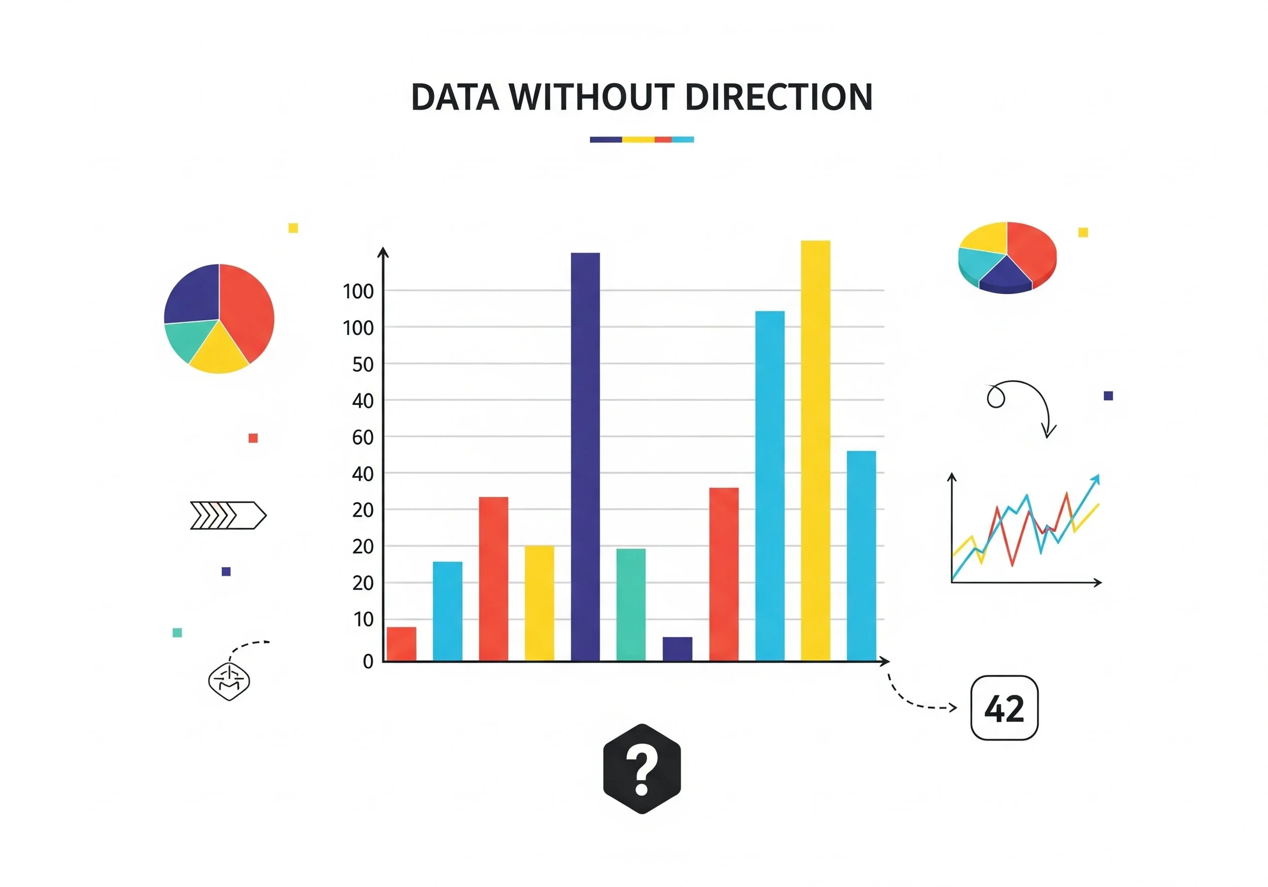
Confusing unlabeled chart example
Why Unlabeled Visuals Undermine Credibility
A chart without a label is like a prescription without a dosage—dangerous or useless. When axes aren’t labeled or timeframes are unclear, the audience is left to guess. That guesswork leads to misinterpretation, reduced trust, and missed opportunities to persuade.
Research on visual cognition shows that clarity cues—like labels, units, and titles—dramatically improve comprehension. It takes only milliseconds for the brain to process visuals, but without labels, the viewer’s brain burns time trying to decode context rather than content. In medical presentations, that’s cognitive bandwidth we can't afford to waste.
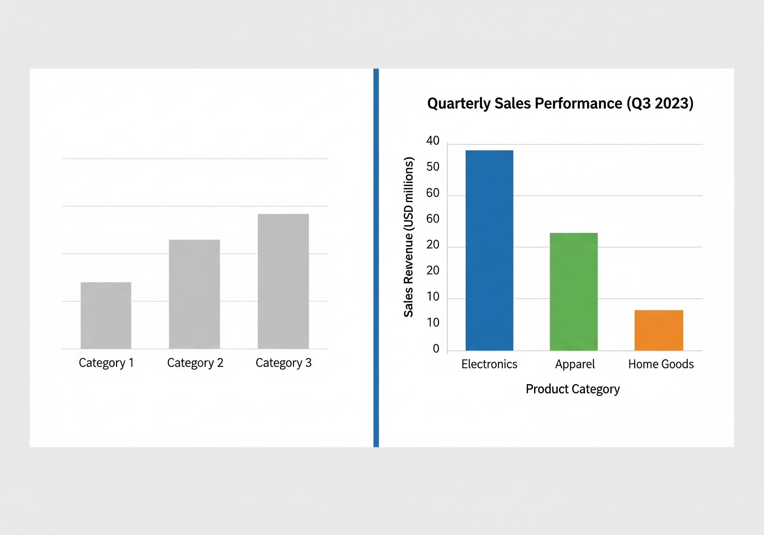
Unlabeled vs labeled chart comparison
What to Label—and How to Do It Right
Start with the basics: Every axis needs a name and unit. If it’s a time series, add the timeframe. If it’s patient data, clarify what each number represents. Never assume your audience knows what you know.
Use bold titles that explain the takeaway—not just 'Chart 1' or 'Results'. Include annotations when needed: arrows, highlights, or boxed text that guide the eye. Keep fonts readable (minimum 18pt for projection) and colors high-contrast. And always test your slide: can someone understand it in 5 seconds without hearing you speak?
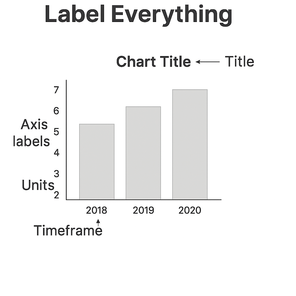
Chart labeled with all elements
Fast Fixes for Better Labeling
You don’t need a design degree to make labeling work. You just need discipline.
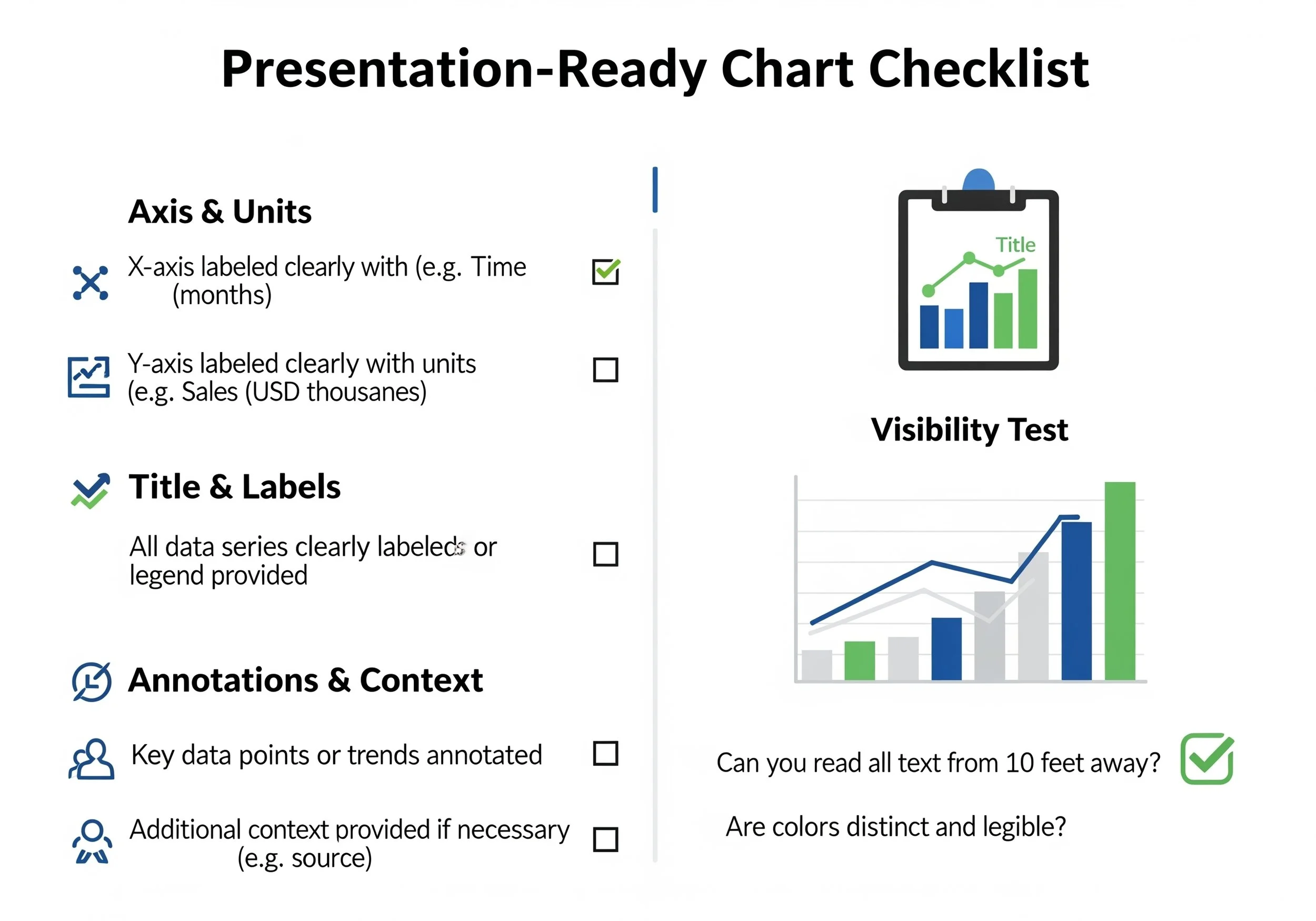
Try this checklist:
• Label every axis with name + units (e.g., 'Blood Pressure (mmHg)')
• Use a title that states the key message (e.g., 'Falls decreased 32% post-intervention')
• Annotate your most important data point
• Test legibility from 6 feet away
Remember: Your visuals are part of your clinical communication. Treat every label like a vital sign—it should be obvious, accurate, and easy to interpret.
Slide makeover with labeling
Quick Takeaways
✅ Label every axis with both name and unit
✅ Use one-sentence titles that explain the chart
✅ Highlight key data with annotation or color
✅ Avoid abbreviations without explanation
✅ Check visibility: can you read it from across the room?
✅ Every chart = one clear message
Conclusion
Your slides are read faster than they’re heard. That means labels aren’t decorative—they’re essential. Think of them as the signage of your message. If it isn’t labeled, it isn’t clear.
Challenge
Pick one chart from your last presentation and test it: Are all axes labeled? Are units included? Is the title clear? If not—fix it now. Labeling is one of the easiest ways to boost clarity.
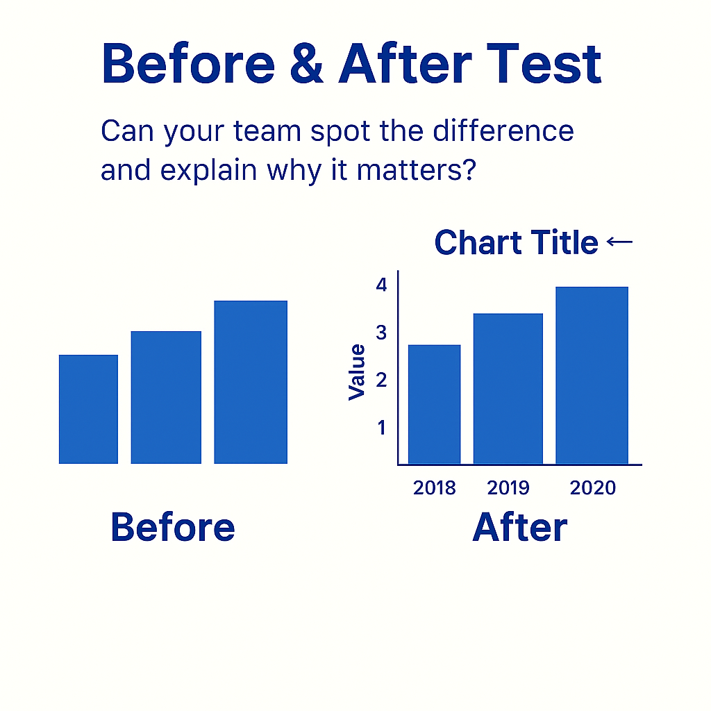
Labeling clarity before and after
Next Week Preview
Next up: We’ll tackle slide clutter by exploring why one visual per slide is the secret to simplicity.
Call to Action
What’s the most confusing chart you’ve ever seen—and how would you fix it? Share it with us on LinkedIn or Twitter.