
Blog #8: The Single-Image Fix: Why One Visual Per Slide Is a Clinical Must
"Simplicity is the ultimate sophistication." — Leonardo da Vinci
The relentless pace of medicine leaves little room for ambiguity. In a world of complex diagnoses and high-stakes decisions, every moment—and every slide—counts. So why do we tolerate visual clutter that slows us down? From grand rounds presentations to research talks, a single slide can become a battlefield of competing ideas: a complex table here, a busy graph there, and a wall of bullet points that no one can read. We often think that cramming more information onto a single slide saves time, but the opposite is true. The more our audience has to decode, the more likely they are to miss the one critical takeaway. The cognitive load on a physician or researcher, already at capacity, becomes overwhelming. This is where the SlidesRx philosophy of one visual per slide becomes not just a design tip, but a clinical imperative. By focusing your audience's attention on a single, powerful visual, you respect their time, reinforce your credibility, and ensure your message is not just seen, but truly understood. It’s about more than aesthetics; it’s about making your communication as precise as your practice.

A doctor facing a vortex of chaotic, cluttered data
🔬 The Data Dilemma: More is Less
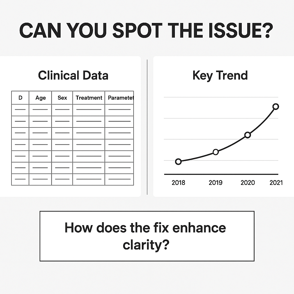
In clinical presentations, there’s a temptation to display every piece of data you have. You've worked hard on your research, so it feels wrong to leave anything out. The result? A single slide with a 12-column table and three different graphs, each with its own legend. The human brain, however, is not a spreadsheet. Research from institutions like MIT's Brain and Cognitive Sciences department shows that we process visual information far more quickly and effectively than text. When a slide contains multiple competing visuals, the brain must decide where to focus. This introduces what’s known as "switch cost"—the mental energy spent bouncing between different data points, trying to find the connection. By committing to one visual per slide, you eliminate this switch cost entirely. You present a singular, focused idea, allowing your audience to absorb the information without distraction and freeing up their mental resources to listen to your narrative, not just read your slides. This is a subtle but profound shift in how you communicate. It’s the difference between showing a data dump and telling a data-driven story.

Data as an unorganized pile versus a clear narrative line.
🎯 The Focus Fix: How to Choose Your One Visual
The question isn’t whether to use one visual, but which one. What is the single, most important point you want your audience to take away from this slide? This is the core of the SlidesRx approach. Your visual should act as a high-powered spotlight on that one point. For a clinical trial, instead of showing the entire table of secondary endpoints, show a single bar chart comparing the primary outcome. If you’re presenting a case study, use a single, high-quality before-and-after image of a diagnostic scan instead of a gallery of small, low-resolution shots. The key is to be ruthless in your selection. You can always refer to supplementary data in an appendix or a handout. By curating your visuals, you make a powerful statement: "I have distilled the most critical information for you." This demonstrates expertise and a deep respect for your audience's time. It elevates you from a presenter to a leader—someone who can cut through the noise and deliver clarity.

A single icon under a powerful spotlight, surrounded by unused ones.
✨ The White Space Advantage: Simplicity as a Strength
Many presenters fear "empty" space on a slide. It's a common misconception that every inch of a slide must be filled to demonstrate the depth of your knowledge. But this "fear of emptiness" is a significant cause of visual clutter. In design, this empty space is known as white space, and it is one of your most powerful tools. White space gives your content room to breathe. It creates a visual hierarchy, guiding the eye directly to your key visual and away from any distractions. Think of it as the surgical approach to slide design—you're not just adding content, you're carefully excising everything that isn't essential. By giving your single visual a clean background with plenty of white space, you give it the prominence and impact it deserves. This is a simple but transformative habit that will make your presentations feel more professional, authoritative, and, most importantly, clear.

A surgeon's hand removing clutter from a slide.
Quick Takeaways
Focus on One Idea: Each slide should have a single, primary objective or takeaway.
Embrace Ruthlessness: Be willing to cut non-essential text, data, and decorative visuals.
Show, Don't Tell: Use your one visual to demonstrate your point, allowing you to speak to the why and the so-what.
Use White Space: Give your visual room to breathe; the empty space is as important as the content.
Think Like a Designer: Use a consistent color scheme, font, and icon style to create a cohesive deck.
Iterate and Refine: The first draft is never the final one. Review your slides and ask, "What is the one thing I want them to remember?"
Conclusion
The principle of one visual per slide is not a rigid rule, but a powerful mindset. It forces you to distill your complex clinical insights into their purest, most impactful form. This is the essence of what we call “clinical clarity.” It’s about more than making a pretty slide; it’s about making a profound connection with your audience, ensuring your message is understood, retained, and acted upon. When every slide serves a singular, focused purpose, your entire presentation becomes a cohesive, compelling, and unforgettable experience.
Before/after of a cluttered slide vs. a clean single-visual slide.
Next Week Preview
Next week, we're diving into the second crucial step of the SlidesRx Checklist: Chart Clarity. We’ll show you how to choose the right chart for the right data, transforming comparisons and trends into instantly understandable visuals.
Call to Action
Ready to apply this to your own slides? Share a picture of your favorite simplified slide on LinkedIn or Twitter and tag us! We’d love to see your work and answer any questions you have. What’s one slide you’re going to fix first using this single-visual principle?