
Blog #9: The Right Chart, Every Time: Bar Charts for Comparisons, Lines for Trends
“The road to success is always under construction.” – Lily Tomlin
In the fast-paced world of medicine, clarity isn't just a preference—it’s a clinical necessity. The same goes for your presentations. A poorly chosen chart can lead to confusion, wasting your audience's time and, more importantly, obscuring critical insights. It’s a common pitfall: a beautiful but illegible 3D pie chart, a scatter plot with no visible trend, or a line graph that shows nothing but noise. At SlidesRx, we believe that every element on your slide should serve a purpose, especially your data visualizations. When you understand the fundamental purpose of each chart type, you can make a simple but powerful decision that transforms your data from a jumble of numbers into a clear, compelling story. It’s the difference between a patient understanding their treatment plan and simply nodding along.
Visualizing data effectively isn’t about being an artist; it’s about being a better communicator. And a better clinician. It starts with a simple rule: use bar charts for comparisons and line charts for trends. This foundational principle is the cornerstone of the SlidesRx Checklist for Chart Clarity, ensuring your data always speaks with authority and precision. In this blog, we'll break down the what, why, and how of this essential rule, helping you choose the right visual aid every time, without a second thought.
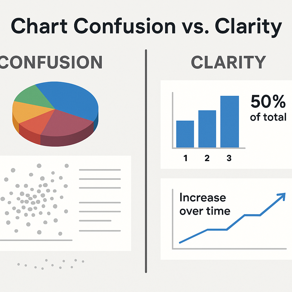
Before-and-after of confusing vs. clear charts.
📊 Bar Charts: The Gold Standard for Comparisons
When you want your audience to compare discrete categories, there is no better choice than a bar chart. Bar charts excel at showcasing a single value across multiple items, like comparing the efficacy of three different drugs, the number of patients treated in various clinics, or the frequency of a certain diagnosis in different age groups. The human brain is incredibly adept at comparing the lengths of bars, making it easy to spot the highest, lowest, and intermediate values at a glance. Generic presentation guides often suggest more complex chart types, but in clinical settings, simplicity reigns supreme. Studies show that when presenters use a simple bar chart to display a comparison, audiences retain the information more accurately and for longer periods. This is because bar charts eliminate mental gymnastics—there’s no need to decipher angles or colors; the answer is right there in the height of the bar. For your next research presentation or grand rounds, if your key message involves comparing one thing to another, think "bar."
The key is to keep it clean. Avoid excessive labels, 3D effects, and gradients. Just the bars, the labels, and the takeaway. Think of it as a clean surgical field—each element has a purpose and is precisely where it needs to be. For instance, if you are comparing the average hospital stay for patients with and without a new protocol, a bar chart makes the difference immediately apparent. This isn't just a design choice; it's a strategic one that respects your audience's time and cognitive load. The best slides are those that allow the audience to understand the message in less than three seconds, and bar charts are designed to do just that for comparisons.
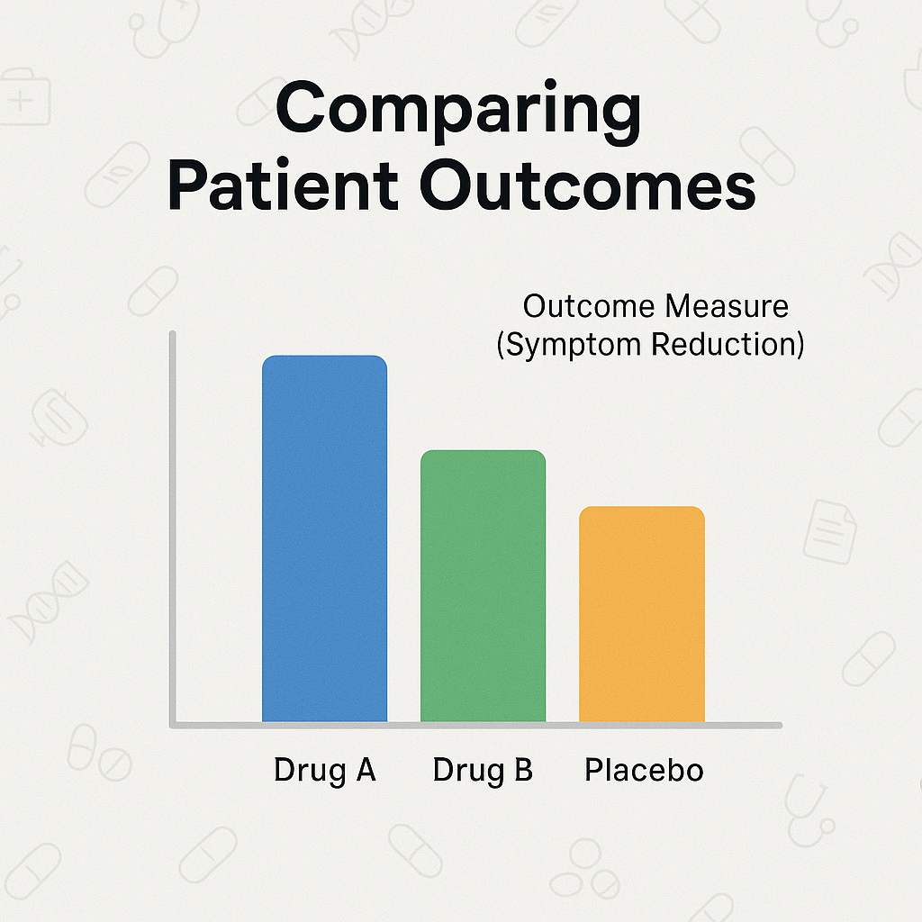
Bar chart comparing different treatment outcomes.
📈 Line Charts: The Natural Choice for Trends
When your data tells a story over time, a line chart is your narrator. The line chart's primary purpose is to show continuous change, revealing trends, fluctuations, and progression. Whether you’re charting a patient’s recovery trajectory, tracking disease prevalence over a decade, or monitoring a drug's absorption rate over hours, the continuous line is intuitive. This visual continuity allows the audience to follow the flow of data points and understand the "journey" of the information. Using a bar chart for this type of data, where each time point is a separate bar, breaks this continuity and forces the audience to compare each point individually, missing the overarching trend.
Generic advice often overcomplicates this by suggesting complex multi-series line charts with too many lines. The SlidesRx approach is to focus on one or two key data series. What is the most important trend? Highlight that line with a bold color and a clear annotation. Other lines can be faded into the background. For example, if you are presenting on the effectiveness of a new therapy, you would use a line chart to show the key biomarker’s improvement over weeks. You could then add a second, lighter line showing the control group’s progression for direct comparison. This method is far more effective than forcing the audience to mentally connect a series of disconnected bars. Remember, a trend is a narrative, and a line chart is the simplest way to tell that story. It’s all about guiding your audience’s eye and mind to the most important pattern in your data, respecting their attention and time.
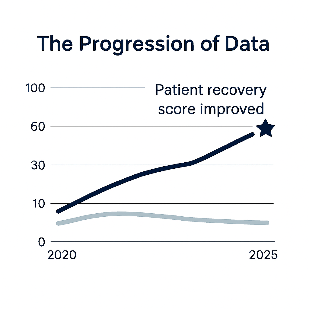
Line chart showing a clear clinical trend over time.
🤝 Beyond the Basics: Combining Insights for Impact
While the rule is simple, its application can be nuanced. Sometimes, your data has both a comparative and a trend component. In these cases, the decision rests on your core message. Do you want your audience to see the relative difference between two groups at a single point in time, or do you want them to understand the overall trajectory of both groups over time? Often, the most compelling presentations use a sequence of charts to tell a complete story—a line chart to establish a trend, followed by a bar chart to highlight a key finding at the final time point. This is the essence of "chart surgery," a SlidesRx concept where you treat your data with the precision it deserves. Instead of cramming all your information into one complex chart, you break it down into digestible, single-message visuals.
This multi-slide approach is a major gap in most generic presentation advice, which often promotes data-dense "infographics." For medical professionals, where every data point can matter, a singular, focused slide ensures no detail is lost in the noise. For example, you might have one slide with a line chart showing the progression of blood pressure over six months for two different patient cohorts. The next slide could be a bar chart comparing the final average blood pressure of those two groups, emphasizing the clinically significant difference. By separating these two messages, you ensure each one lands with maximum impact. You’re not just presenting data; you’re guiding your audience’s thinking, leading them to the same conclusion you reached. This is how you transform a good presentation into a great one—by mastering the basics and applying them with clinical precision.
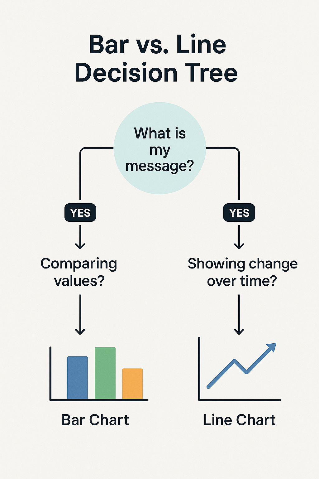
A flowchart for selecting the right chart type.
Quick Takeaways
Bar Charts for Comparisons: Use them to compare discrete values across different categories (e.g., patient groups, drug efficacies).
Line Charts for Trends: Use them to show how data changes continuously over time (e.g., patient vitals, disease progression).
Avoid Overcomplication: Steer clear of 3D charts, messy legends, and too many data series.
One Chart, One Message: Focus on a single, clear takeaway per slide. Don't force a chart to do more than it's meant to.
Break It Down: Use a sequence of simple charts to tell a complex story instead of one cluttered chart. This improves comprehension and retention.
Conclusion
Mastering the use of bar charts for comparisons and line charts for trends is a foundational skill that elevates your communication from ordinary to exceptional. It’s a simple rule, but its impact is profound. By choosing the right chart type, you’re not just making your slides look better—you’re making your data more accessible, your findings more convincing, and your message more impactful. Clarity is clinical, and in the world of data, that clarity starts with a single, purposeful line or bar.
Challenge
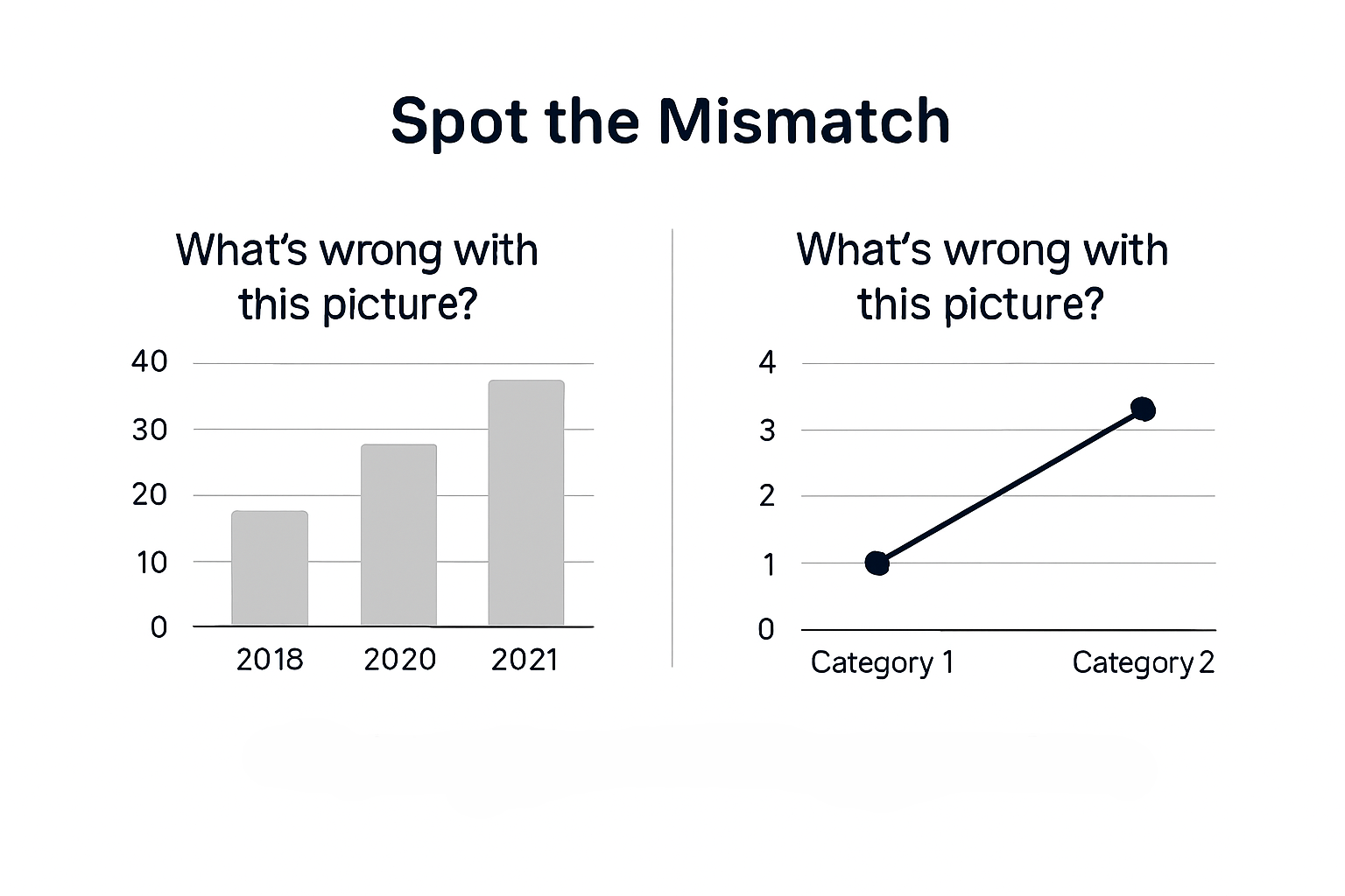
Comparison graphic for a chart-selection challenge.
Next Week Preview
Next week, we'll continue our SlidesRx Checklist for Chart Clarity by tackling another common presentation issue: unnecessary visual noise. We'll show you how to remove 3D effects, excess gridlines, and extra data series to reveal the powerful message hidden within your data.
Call to Action
Ready to apply these principles? Try a “chart surgery” on one of your next slides—transforming a cluttered visualization into a clear, compelling one. Share your before-and-after in the comments! What's the most confusing chart you've ever seen, and how would you fix it with these simple rules?