
Blog #10: Remove 3D Effects, Gridlines, or Extra Series
"Clarity is the key to effective communication." — Jiddu Krishnamurti
Introduction
As a medical professional, every slide you create is a diagnostic tool for your audience. A well-designed chart can reveal a critical insight at a glance, while a cluttered one can mask the truth, burying your findings in visual noise. When you’re presenting patient data, research results, or educational material, there’s no room for ambiguity. Yet, many of us unknowingly default to chart styles that add distraction rather than clarity. We use unnecessary 3D effects that distort data, excess gridlines that compete with the very bars and lines they’re meant to support, or extra data series that overwhelm the key takeaway.
These elements might seem harmless—or even look "polished"—but they serve no clinical purpose. They are static on a screen, but they create mental friction for your audience, forcing them to work harder to see the signal through the noise. This is the difference between a chart that informs and a chart that confuses. The SlidesRx approach is simple: Your chart should be a clear window to your data, not an obstacle course. Let’s perform some chart surgery to remove the unnecessary and let your clinical findings shine.
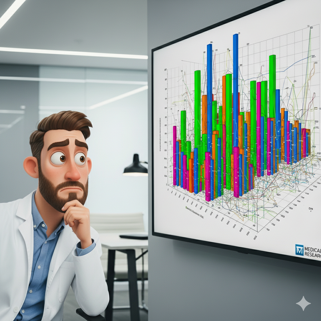
Researcher frustrated by a visually cluttered data chart.
💊 Why 3D Effects Don’t Belong in Clinical Slides
Three-dimensional charts, whether they are pie, bar, or area charts, are a common pitfall in presentations. They often appear to add a dynamic, modern flair, but their true effect is to distort and obscure data. The very angles and perspectives that make them “3D” also make it nearly impossible to accurately compare values. For instance, in a 3D bar chart, the bars in the front can appear disproportionately large compared to those in the back, and the angle of the "pie" in a 3D pie chart can make one slice look significantly bigger or smaller than it actually is. This isn’t just an aesthetic problem; it’s a clinical one. When you're presenting a statistically significant finding or comparing two crucial patient groups, any visual ambiguity is a direct threat to your message. Your audience is trained to look for precision and patterns, and a distorted visual breaks that trust. By flattening your charts into a simple 2D view, you remove the visual guesswork and allow the numbers to speak for themselves. This small change ensures your audience can focus on the data, not on trying to see around a visual artifact.
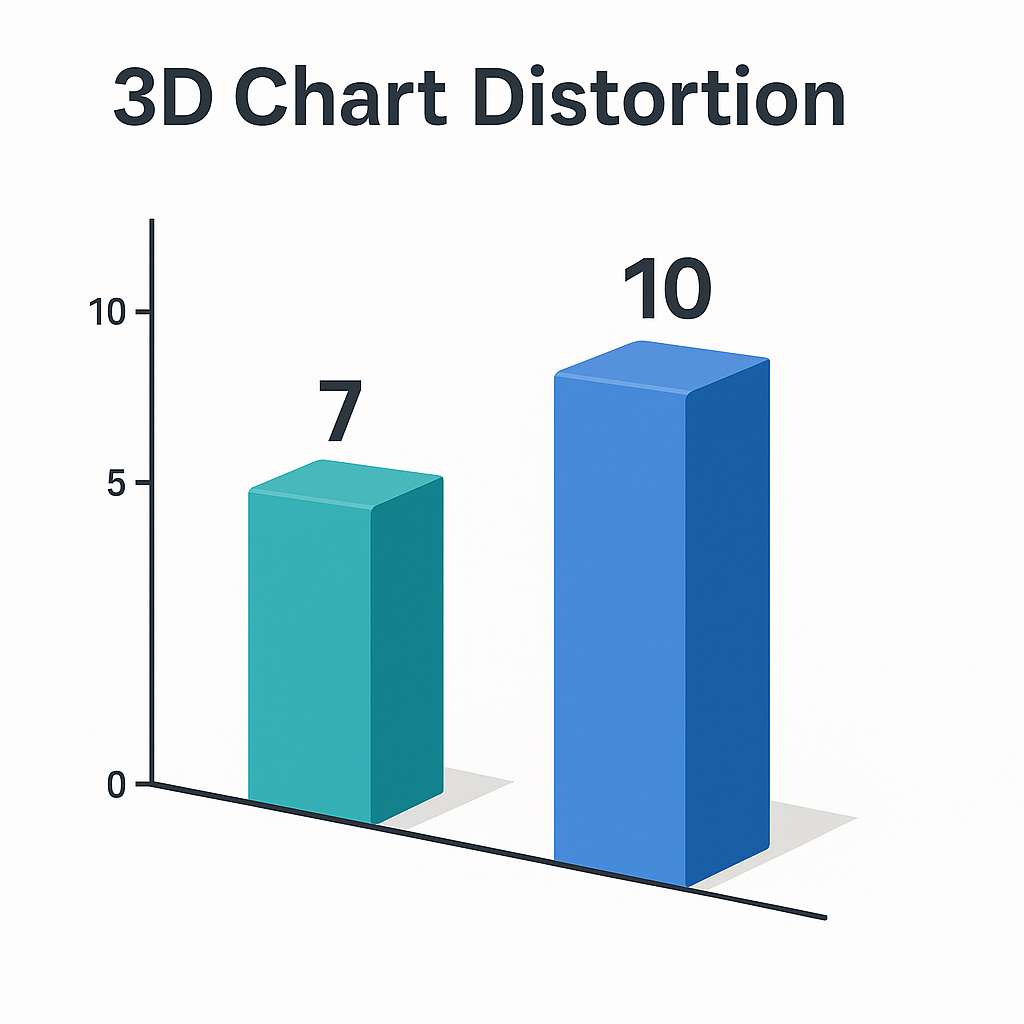
A 3D bar chart visually misrepresenting data.
🚧 The Case Against Unnecessary Gridlines
Gridlines are a tool, not a decoration. Their purpose is to help the audience quickly estimate the value of a data point on a chart. However, when a chart is already clearly labeled with values, or when the gridlines are too prominent or numerous, they stop being helpful and start becoming a distraction. Think of it like this: your audience is trying to find the path in a field, and the gridlines are a fence. A single, thin fence-line might help them orient themselves, but a dense, dark network of fences will just get in the way. In most clinical presentations, the exact value isn't as important as the trend or the comparison. Is the intervention group doing better than the control? Are the biomarkers trending up or down? A minimal set of horizontal gridlines is usually all you need to aid in quick comparisons, while busy, repetitive gridlines—especially both horizontal and vertical ones—turn your slide into a checkerboard. Remember, every element on your slide should have a clear purpose. If it doesn’t help your audience understand your finding faster, it's a candidate for removal.
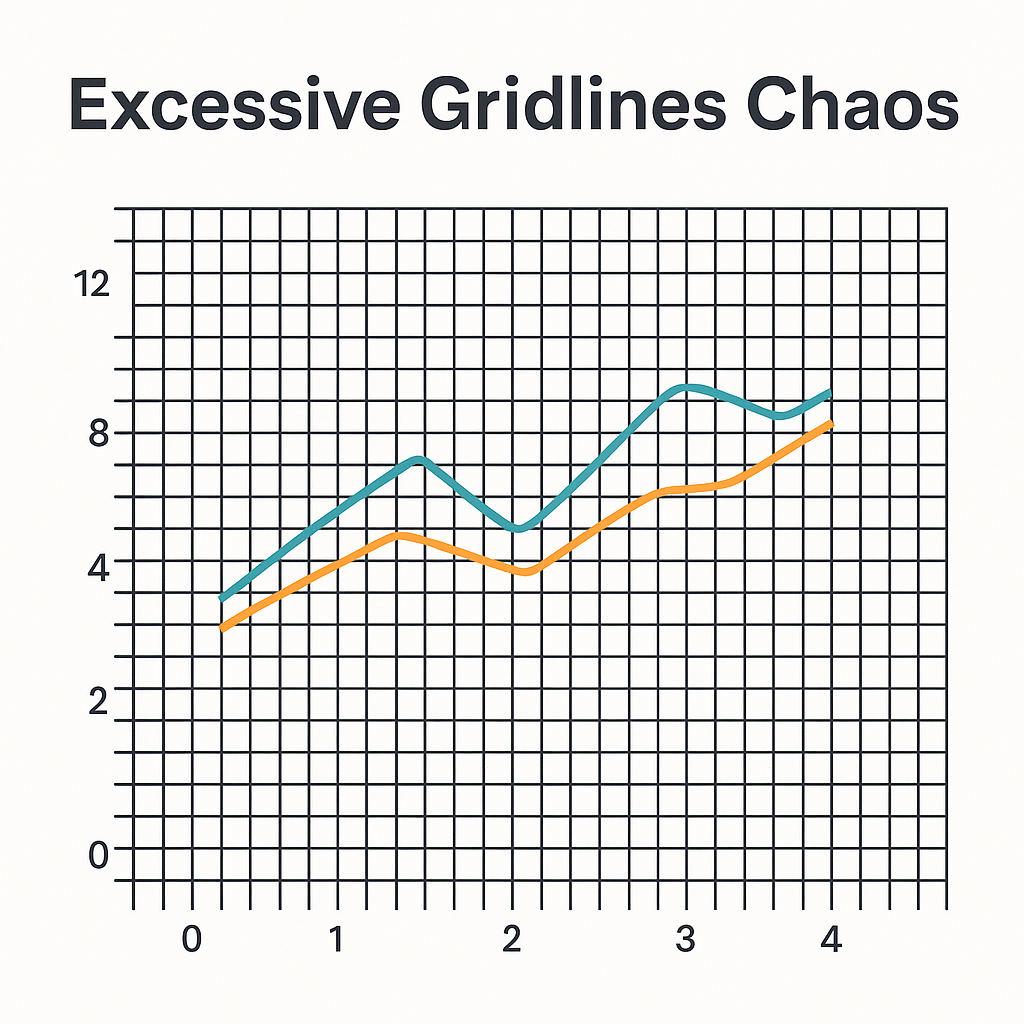
Visually noisy graph with distracting gridlines.
📉 Trimming Extra Data Series for a Focused Message
You’ve collected a wealth of data, and you’re proud of it. But including every single data point and series on a single slide is like shouting every word you know in a conversation—it overwhelms your listener and drowns out the important message. In presentations, your job isn’t to show everything; it’s to show what matters most. Excess data series on a chart can be particularly confusing, as each new series demands its own color, label, and visual space, diluting the focus of the slide. Consider a graph tracking patient recovery. Do you need to show every single biomarker, or should you focus on the two or three that are directly tied to your key conclusion? Your audience needs a clear path to your finding, not a data labyrinth. The SlidesRx Checklist encourages you to ask: "What is the single most important message this chart needs to convey?" Then, ruthlessly remove any data series or information that doesn’t directly support that message. This discipline ensures your slide’s message is impactful and impossible to miss.
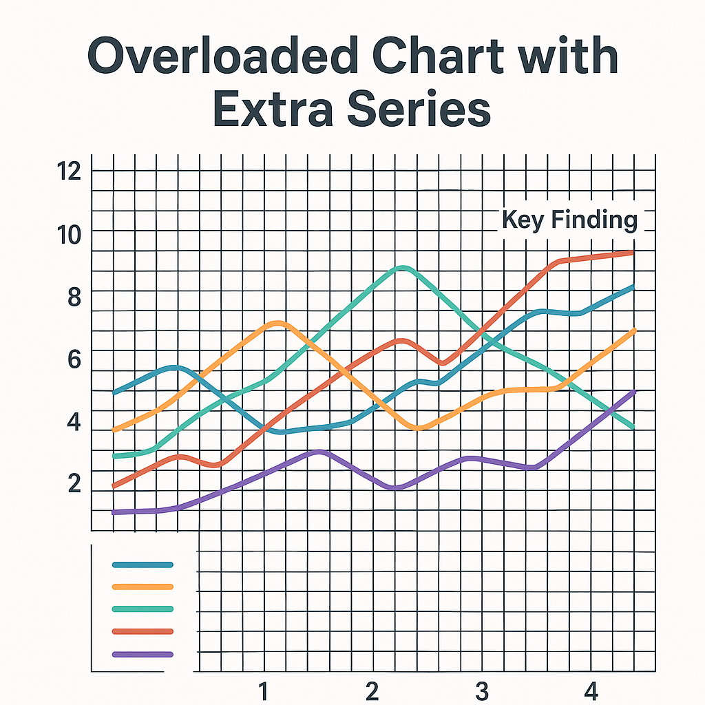
Chart with too many data series and visual noise.
Quick Takeaways
Flatten your visuals: Always use 2D charts over 3D to prevent data distortion.
Gridlines are a tool, not a crutch: Use minimal, light horizontal gridlines or none at all if your data points are labeled.
Focus on one finding: A chart should communicate a single, powerful message.
Remove extra data series: Be ruthless in editing out data that doesn't directly support your key takeaway.
Simplicity is not a lack of effort: It’s a deliberate choice to enhance clarity and respect your audience’s time and attention.
Conclusion
Effective communication is a cornerstone of clinical practice, and your slides are a critical part of that. By deliberately removing visual clutter—the 3D effects, the unnecessary gridlines, and the distracting data series—you transform your charts from decorative objects into powerful tools for discovery. This is the essence of the SlidesRx "Clarity is Clinical" principle: simplifying your visuals to make your insights impossible to miss.
Challenge
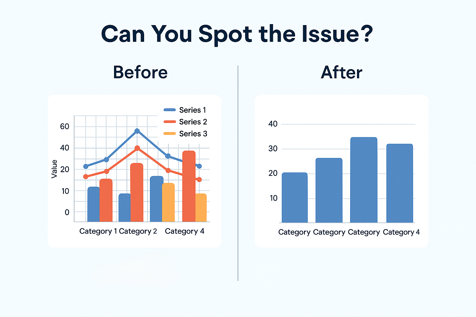
Can You Spot the Issue?
Next Week Preview
Join us next week as we continue our "Chart Clarity" series. We’ll dive into the art of crafting titles that do more than just label your chart—they tell a complete, one-sentence story of your finding.
Call to Action
Ready to upgrade your own presentations? Tell us about a time you saw a "busy" chart that you couldn't understand. What did you wish the presenter had done differently to improve its clarity? Share your stories and help us build a community focused on clinical communication!