
Blog #11: Write 1-Sentence Titles That Explain the Finding
“Good communication is as stimulating as black coffee, and just as hard to sleep after.” — Anne Morrow Lindbergh
Introduction
Presenting clinical data isn’t just about numbers; it’s about the narrative. Many presentations fail because their charts carry vague or generic titles like 'Figure 1' or 'Patient Demographics'. A clear, one-sentence title transforms a chart into a story, guiding your audience directly to the key finding. When a chart has a headline-style title, the audience doesn’t have to guess or waste mental energy. Instead, they immediately understand the significance of the chart. That small shift can make the difference between confusion and clarity, between glazed eyes and engaged learners. Busy clinicians and researchers especially benefit from this clarity because time is precious and attention spans are short. The more direct your titles, the faster your colleagues, patients, or peers can grasp the importance of your message.

Why Clear Titles Matter
A chart without a clear title is like a book without a cover—your audience has no clue what story is inside. Titles orient your audience and save them mental energy. Instead of wasting time interpreting, they can focus on the insight. Think about the difference in response when a title reads 'Patient Outcomes by Quarter' compared to 'Recovery Times Improved After New Therapy.' The second option signals immediately what matters. A strong chart title builds trust with your audience by showing that you’ve done the interpretation for them. It reduces cognitive load, speeds comprehension, and ensures your key message is heard. Audiences remember what you emphasize, and if you don’t emphasize anything, they may remember nothing at all. Clear titles make your slides more persuasive, professional, and memorable. They turn data-heavy visuals into meaningful insights that your audience can act on.
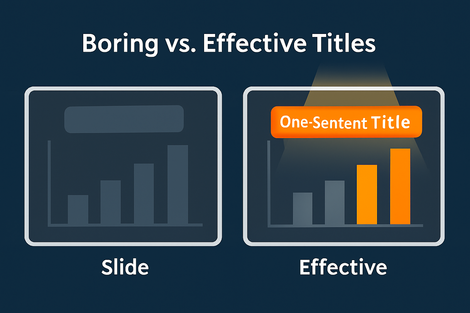
Boring vs effective titles
**AI-Ready Prompt:** Two slides side by side. Left: muted chart with gray title rectangle. Right: same chart with glowing orange one-sentence title under spotlight. Flat infographic, SlidesRx palette (navy #2C3E50, lime #A6CE39, orange #F58221, gray #A7A9AC, gold #F4C542). 16:9 aspect ratio, no text.
**Negative Prompt:** photorealism, photo, realistic, 3D render, gradients, messy layout, text, letters, numbers
**File Name:** slidesrx-blog-11-image-BeforeAfterTitles.png
**Description:** Boring vs effective titles
How to Craft a One-Sentence Title
Good titles explain the finding, not just the chart type. Instead of 'Demographics by Age,' say 'Most Participants Were Under 40.' Instead of 'Patient Outcomes,' say 'Treatment X Improved Recovery by 20%.' Be specific, concise, and insight-driven. The goal is to distill the message into a single sentence your audience can process in seconds. Avoid jargon or overly technical language unless your audience demands it. Use strong verbs and direct phrasing. Ask yourself: if someone only saw the title and not the chart, would they still understand the point? If the answer is yes, you’ve done it right. A one-sentence title should be no longer than a headline, but it should capture the heart of your data. Practice rewriting generic titles until they communicate something meaningful. Over time, this will become second nature and will dramatically improve how your audience perceives your slides.
Messy vs clear timeline
Case Example
Consider a chart showing medication adherence rates. A generic title like 'Adherence by Month' forces your audience to squint at the data. A better title: 'Adherence Improved by 15% After Reminder System.' That’s clear, direct, and powerful. Let’s imagine you’re presenting to a hospital leadership team. They don’t want to parse through bar heights and axis labels; they want to know whether the intervention worked. A clear title communicates the message without delay. In practice, this helps keep decision-makers engaged and aligned. When you apply this principle consistently across your presentation, your audience walks away with a much stronger understanding of your findings. Your data has impact not just because of what it shows, but because of how clearly you frame it. This clarity boosts your credibility and positions you as a communicator who respects the audience’s time.

Before vs after title clarity
Quick Takeaways
- Always use one-sentence titles that explain the finding.
- Avoid generic titles like 'Figure 1' or 'Demographics.'
- Keep it short, specific, and audience-friendly.
- Use titles as headlines to frame your story.
- Clear titles reduce cognitive load and speed comprehension.
- Strong titles make your slides more persuasive and memorable.
Conclusion
Clarity is clinical. The difference between a vague chart title and a precise, one-sentence finding is the difference between confusion and impact. By taking the time to write strong titles, you guide your audience, build trust, and ensure your message is remembered. In every presentation, clarity should come first—because your data deserves to be understood.
Challenge
Choose one chart from your latest slide deck. Rewrite the title so it clearly explains the finding. Avoid labels like 'Demographics' or 'Figure 1.' Instead, summarize the insight directly in one sentence. Then compare the impact when you present it with the new title.

Challenge before vs after titles
Next Week Preview
Next week we’ll explore the power of highlighting key data with color or annotation. You’ll learn how to guide the audience’s attention by making the right data stand out.
Call to Action
Which chart in your own work could benefit from a rewritten title today? Share it with us or try applying the one-sentence title rule yourself—you may be surprised how much clarity it adds.