
Blog #12: Highlight Key Data with Color or Annotation
“Attention is the rarest and purest form of generosity.” — Simone Weil
Introduction
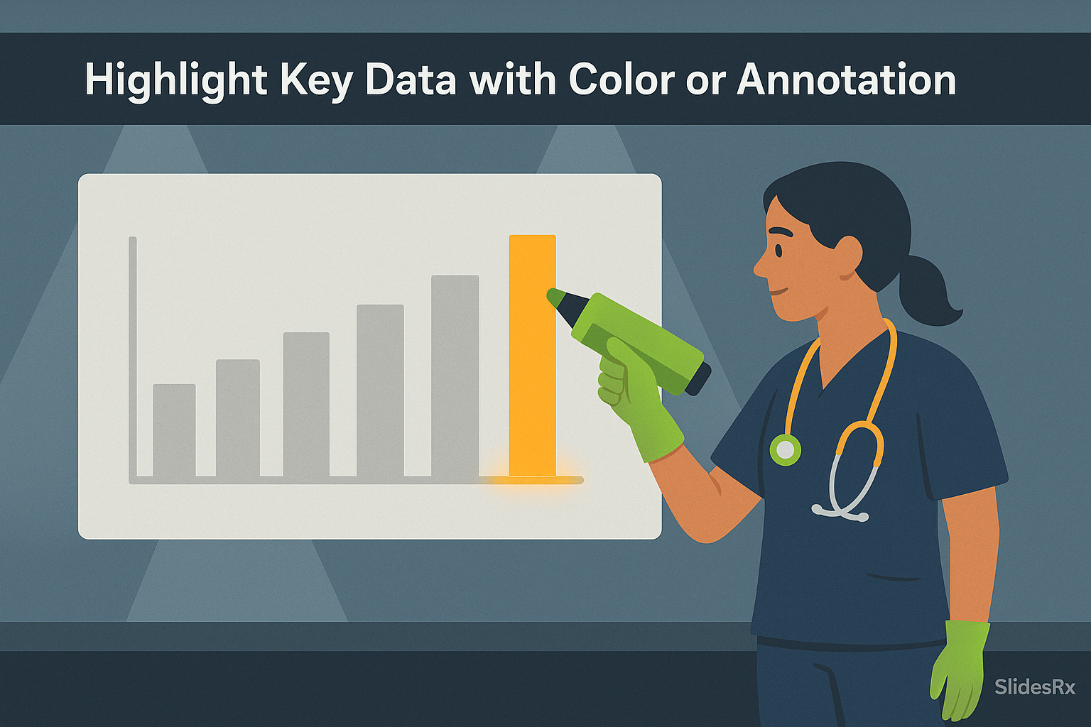
Highlighting isn’t just decoration—it’s direction. In presentations, our audiences are often drowning in data. Without cues, they don’t know where to look. A well-placed highlight—whether it’s a pop of color or a subtle annotation—shifts attention exactly where it belongs. Think of it like a flashlight in a dark room: the data was always there, but now it’s unmistakable.
For busy clinicians and researchers, this is not just helpful, it’s essential. Time is short. If the audience has to hunt for the finding, they’ll miss it. By strategically applying color or annotation, you reduce effort and increase impact. The best highlights guide without overwhelming. A single bar in orange or a small arrow can elevate comprehension faster than adding more words. Done well, your highlights become the silent narrator of your data story.
Why Highlights Work
Highlights work because they tap into how the brain processes information. We are wired to notice contrast. When everything on a slide is the same color and weight, the audience has to work harder to decide what matters. But when one bar is orange or a single point is labeled, the brain’s attention system snaps to it instantly. This is not just design theory—it’s neuroscience. Highlights reduce cognitive load by removing the need to search. They also build trust, because you are guiding the audience toward the point that matters most instead of leaving them lost in the data. Highlights say: 'This is important—look here.' Without them, slides often become wallpaper, with insights buried. With them, you create clarity and signal confidence. A clinician scanning your chart should know exactly where to focus, even if they only glance for three seconds. That’s the power of highlighting.
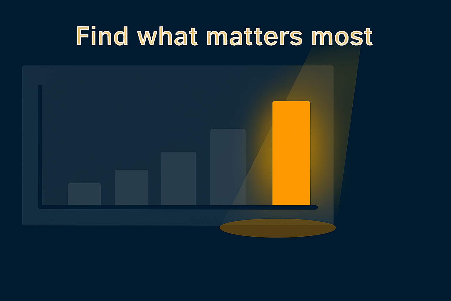
Spotlight revealing single glowing bar like treasure
Color vs. Annotation
There are two main tools for highlighting: color and annotation. Color creates instant contrast. An orange bar in a field of gray jumps out without explanation. Annotation, on the other hand, adds a subtle guide: an arrow, circle, or short label that points the eye to the key point. Both methods are powerful, but the best presentations often combine them. Imagine a chart where one bar is glowing orange and a lime arrow points to it. The effect is unmistakable but not overwhelming. The audience doesn’t have to guess—they are shown where to look. The key is restraint. Too many highlights dilute the effect and confuse. Use one color pop or one arrow per chart, not five. Highlighting should amplify your message, not fight for attention. Color says 'different,' annotation says 'why.' Together, they make your data unmissable.

Annotation target lock
Case Example
Consider a survival chart comparing two treatments. If all lines are shades of gray, the audience has to work to distinguish them. But if one line is orange, the message becomes obvious: this is the line to watch. Now add a subtle annotation: 'New therapy,' with a lime arrow pointing at the orange line. The insight is immediate. No one has to squint or guess. This is how highlights change the game—they collapse interpretation time and reduce confusion. In a medical conference, you may only have a minute per chart. A clear highlight ensures your main finding lands instantly. Without it, you risk losing attention. With it, you not only hold attention, you direct it exactly where it matters. The lesson: don’t hope your audience will find the key data. Shine a spotlight on it.
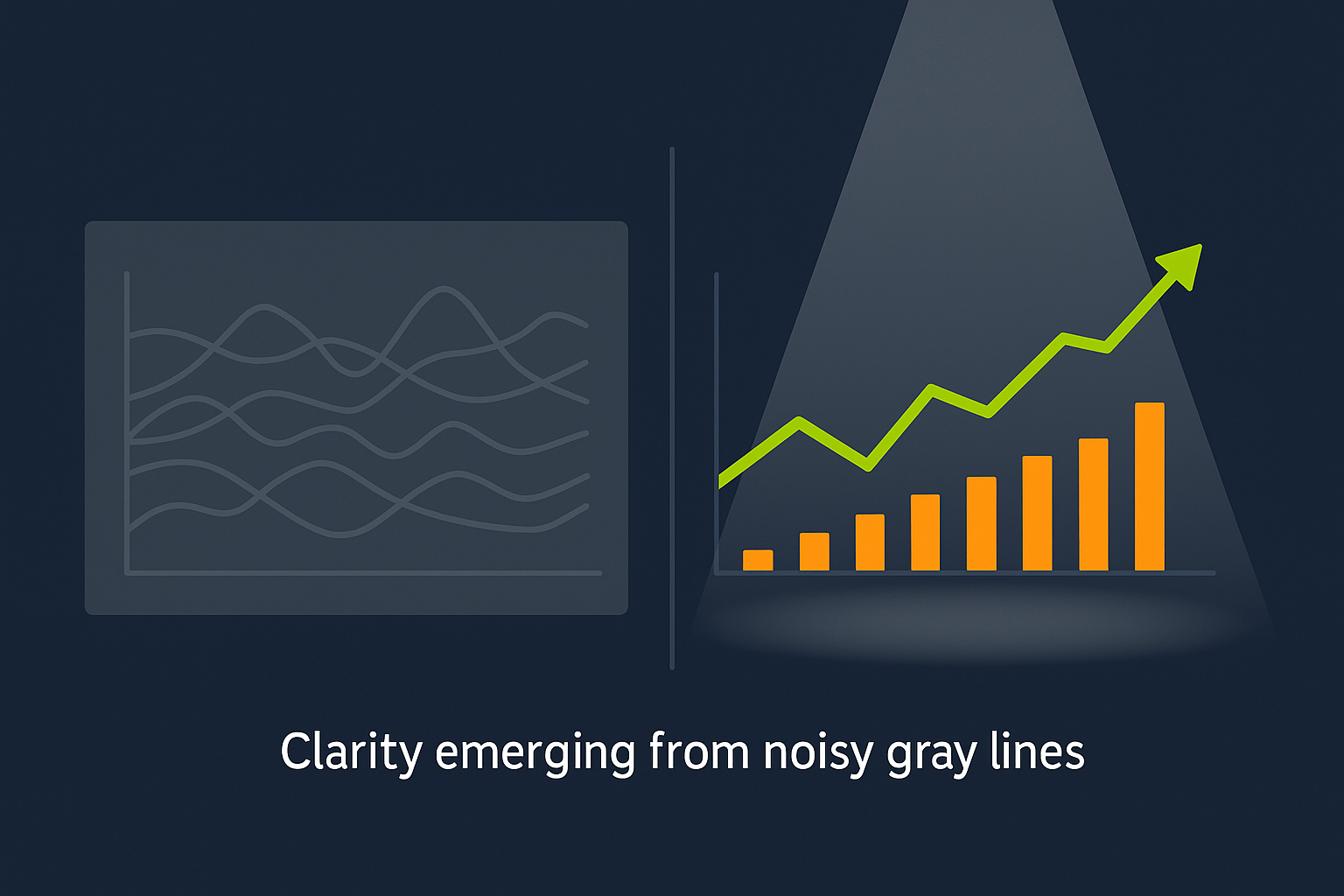
Clarity emerging from noisy gray lines
Quick Takeaways
- Highlights guide attention instantly.
- Color creates contrast; annotation provides direction.
- Use restraint: one highlight per chart is powerful.
- Highlights reduce cognitive load.
- Combined color + annotation delivers maximum clarity.
Conclusion
The best slides don’t just show data—they guide the eye. Highlights, whether through color or annotation, transform charts from confusing to clear. For busy audiences, this is more than design—it’s respect. You’re showing them exactly what matters, without wasting their time. When your highlights are simple, consistent, and purposeful, your data speaks louder than words.
Challenge
Choose one slide in your deck where the key finding isn’t obvious. Add a single highlight: change the bar color, circle the point, or add a subtle arrow. Notice how much easier it is for your audience to understand the story.

Before vs after highlight clarity with checkmark
Next Week Preview
Next week we’ll focus on the '6x6 rule'—keeping slides clean with no more than six bullets, six words each. You’ll see how structure improves clarity as much as design does.
Call to Action
What’s one chart in your slides that could benefit from a highlight today? Try it now—then watch how quickly your audience locks onto the insight.