Blog #19: Using Color With Purpose in Clinical Posters
"Colors, like features, follow the changes of the emotions." — Pablo Picasso
Introduction
You've mastered evidence-based font sizing and understand that readable typography forms the foundation of effective poster communication. But when you step into a conference hall filled with dozens of competing displays, your perfectly readable poster can still disappear into visual wallpaper (yes, even with that impressive 70-point title you carefully sized). The difference between posters that command attention and those that blend into academic background noise often comes down to strategic color decisions. Too many researchers treat color as decoration—a finishing touch applied after content is complete. The truth is that color psychology operates faster than conscious thought, with research showing visual processing occurs within 100 milliseconds of contact.
Strategic color use in clinical posters isn't about creating rainbow displays or matching institutional branding guidelines—it's about leveraging neurological attention mechanisms to guide viewers through your research story systematically. While specific research on color effectiveness varies across studies, design principles and accessibility guidelines provide clear frameworks for color choices that enhance comprehension when applied strategically, while also creating cognitive overload and accessibility barriers when used carelessly. When your color palette functions like clinical protocols—purposeful, systematic, and evidence-based—your research communication becomes both engaging and inclusive.

The Science Behind Color Attention
Neuroscience research confirms that color processing occurs in the brain's visual cortex within approximately 100 milliseconds—significantly faster than text recognition or shape identification. This means your color decisions literally determine first impressions before viewers process any written content. Studies of visual attention consistently show that strategic color application can enhance poster effectiveness, but only when color serves clear functional purposes rather than decorative ones.
The critical gap most researchers miss is understanding color hierarchy in competitive visual environments. Conference halls create sensory overload where dozens of posters compete simultaneously for limited attention resources. Random color application creates visual chaos that exhausts viewers, while strategic color guidance reduces cognitive load and improves information retention by directing attention deliberately through research narratives (look, we've all seen those rainbow posters that make your eyes hurt from six feet away).
Here's the breakthrough insight: effective clinical poster color functions like hospital wayfinding systems—it must cut through environmental noise and guide navigation efficiently under time pressure. When your color palette follows established design principles rather than aesthetic preferences, viewers process your hierarchy intuitively. Your color becomes invisible infrastructure that makes complex research accessible, not decoration that competes with content for cognitive resources.

Building Strategic Color Protocols
Professional clinical poster color follows the well-established 60-30-10 accessibility rule: 60% neutral background (white or light gray) for reading comfort, 30% primary brand color (navy, blue, or green) for organizational elements, and 10% accent color (orange, red, or yellow) for critical highlights and key data points. This distribution ensures adequate contrast ratios while preventing cognitive overload that occurs with rainbow approaches.
Color selection must prioritize both attention direction and accessibility compliance. WCAG guidelines specify minimum contrast ratios of 4.5:1 for normal text and 3:1 for large text to ensure readability for viewers with visual impairments while improving legibility under harsh conference lighting. Blues convey scientific credibility and trust, making them ideal for headers and organizational elements. Orange and red create urgency and draw attention to key findings. Green suggests positive outcomes and growth, perfect for highlighting successful treatment results.
The transformation happens when you test color combinations under actual conference lighting conditions before finalizing designs. Fluorescent lighting, competing displays, and visual fatigue all affect color perception dramatically. Professional poster designers print color samples and evaluate performance under harsh lighting to ensure accessibility and attention-directing functions remain effective throughout long conference days.

Color as Clinical Communication Infrastructure
Think of poster color like medication labeling systems—different colors immediately communicate different types of information and urgency levels. Your background must provide maximum contrast for text readability, while accent colors guide attention to critical findings without creating visual competition. Systematic color coding helps viewers navigate complex research efficiently: methodology in one color family, results in another, conclusions in a third.
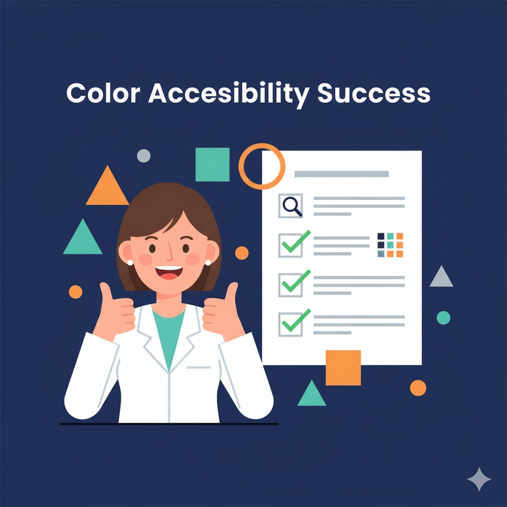
Accessibility considerations aren't optional additions—they're fundamental requirements that improve communication for all viewers. Colorblind-friendly palettes (avoiding red-green combinations) ensure your research reaches the approximately 8% of male and 0.5% of female conference attendees with color vision deficiencies. High contrast benefits everyone, from tired viewers scanning dozens of posters to international audiences processing information in non-native languages.
Here's what separates amateur from professional clinical poster color strategy: amateurs choose colors based on personal preferences or institutional requirements, while professionals engineer color systems that perform reliably under conference conditions while meeting accessibility standards. When your color palette functions like clinical infrastructure—systematic, inclusive, and performance-optimized—your research communication becomes both compelling and universally accessible. That's when clarity becomes clinical—your color choices deliver your research insights with the same reliability your clinical work demands.

Quick Takeaways
Follow 60-30-10 accessibility rule: 60% neutral background, 30% primary color, 10% accent highlights for optimal contrast
Maintain WCAG contrast ratios: minimum 4.5:1 for body text, 3:1 for large headers to ensure readability compliance
Use colorblind-friendly palettes avoiding red-green combinations—8% of males have color vision deficiencies
Color processing occurs within 100ms, faster than text recognition—first impressions are literally neurological responses
Strategic color application enhances poster effectiveness when following established design principles rather than decoration
Blues convey credibility, oranges create urgency, greens suggest positive outcomes—choose purposefully for message alignment
Test color combinations under fluorescent conference lighting before finalizing—screen appearance differs from print reality
Color-code sections systematically: methodology, results, conclusions in consistent families for navigation ease
Professional approach prioritizes accessibility and attention direction over aesthetic preferences or branding requirements
Conclusion
Strategic color use transforms clinical posters from academic displays into engaging, accessible communication tools. When your color choices leverage attention psychology while meeting accessibility standards, your research reaches every audience member effectively regardless of visual capabilities or conference fatigue.
Challenge
Audit your current poster design for accessibility compliance using online contrast checkers. Do your color combinations meet 4.5:1 ratios for body text? Are you using colorblind-friendly palettes? Test printed samples under fluorescent lighting to verify performance. Your research deserves universal accessibility.

Next Week Preview
Next week, we're exploring Visual Hierarchy 101 for scientific posters—advanced techniques for structuring titles, headings, and visuals so the audience's eye flows naturally from main message to supporting details.
Call to Action
What's your experience with color strategy in clinical presentations? Have you witnessed the difference between purposeful color guidance and decorative rainbow approaches? Share your color accessibility discoveries and attention-directing successes—we learn from each other's inclusive design evolution.