Blog #18: Choosing Fonts & Sizes for Maximum Readability
"The details are not the details. They make the design." — Charles Eames
Introduction
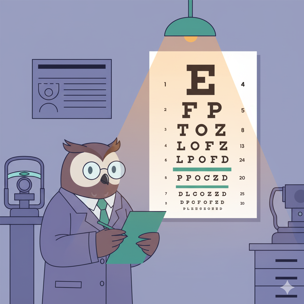
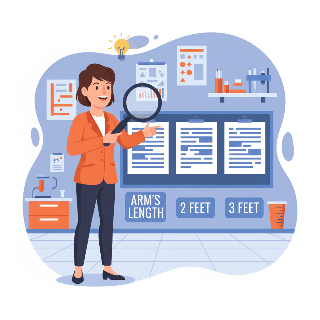
You've mastered the 5-second rule and understand that conference attendees make instant decisions about your poster. But even the most compelling research story falls flat if viewers can't actually read your carefully crafted content from arm's length. The harsh reality of conference poster sessions is that most attendees won't step closer than 2-3 feet unless something immediately grabs their attention—and if they can't read your key findings from that distance, you've lost them forever (yes, even that breakthrough discovery you spent months perfecting). The difference between posters that draw engaged audiences and those that get polite glances often comes down to one fundamental factor: readable typography that performs under real-world conference conditions.
Evidence-based font selection isn't about finding the prettiest typefaces—it's about engineering readability that functions reliably across viewing distances, lighting conditions, and visual fatigue. While specific research on poster readability varies across studies, accessibility guidelines and design principles provide clear guidance about relationships between font size, viewing distance, and reading comprehension that most academic posters unfortunately ignore. When your typography choices follow proven readability principles rather than aesthetic preferences, your research gets the audience engagement it deserves.
The Science of Distance Readability
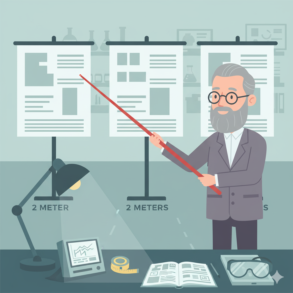
Design principles suggest that comfortable reading requires proportional relationships between text height and viewing distance, though specific formulas vary by application. For poster environments, accessibility guidelines recommend minimum text sizes that ensure readability from typical conference viewing distances of 1-2 meters. Academic poster guides consistently recommend body text of at least 24 points, with many suggesting 30-36 points for optimal readability from meter-plus distances.
The critical gap most researchers miss is understanding that conference environments actively work against readability. Fluorescent lighting creates glare, competing visual stimuli demand extra cognitive effort, and viewer fatigue reduces reading tolerance significantly. Font sizes that work perfectly on computer screens often fail spectacularly when printed at poster scale and viewed under harsh conference lighting conditions (that 12-point text that looked crisp on your laptop? It's basically invisible from two feet away).
Here's the breakthrough insight: effective poster typography functions like clinical signage systems—it must communicate critical information clearly and quickly under suboptimal conditions. When your font choices prioritize performance over prettiness, following evidence-based sizing protocols, your research becomes accessible to audiences who would otherwise walk past. Your typography transforms from decoration into functional communication infrastructure.

Building Evidence-Based Font Protocols
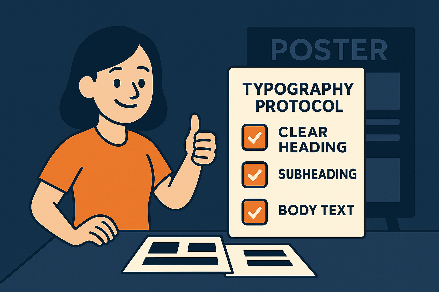
Professional poster typography follows established hierarchies that academic sources consistently support: titles at 70+ points for maximum impact, section headers at 36+ points for clear organization, and body text at 24+ points minimum for distance readability. These aren't arbitrary numbers—they're recommendations that account for real conference viewing patterns and environmental challenges that compromise reading performance.
Sans-serif fonts consistently outperform serif fonts in poster applications according to multiple design resources. Arial, Helvetica, Calibri, and Verdana maintain letterform clarity when viewed from distance and under variable lighting conditions. Serif fonts, while elegant in print publications, lose critical character details when scaled for poster display, creating reading strain that busy conference attendees simply won't tolerate (look, we've all squinted at those delicate serif details from across a poster hall).
The transformation happens when you test typography at actual viewing distances before finalizing designs. Professional poster creators print text samples and evaluate readability from realistic conference distances to ensure optimal performance. What appears bold and clear on screen often becomes thin and fragile when viewed across a conference hall, requiring size adjustments that digital preview can't predict.
Typography That Works Under Conference Pressure
Think of poster typography like hospital emergency signage—every element must function under stress, time pressure, and environmental challenges. Your title needs maximum visual impact at 70+ points, immediately communicating your research value from maximum distance. Section headers require clear hierarchy at 36+ points, guiding readers through your methodology without confusion or cognitive strain.
Body text presents the greatest readability challenge because it carries detailed information while operating under strict distance constraints. Academic poster guides recommend never using body text smaller than 24 points for conference applications, with many suggesting 30+ points for complex technical content. The rule is simple: if viewers must step closer than arm's length to read your content comfortably, your font sizing failed its functional purpose.
Here's what separates amateur from professional poster typography: amateurs choose fonts based on computer screen appearance, while professionals engineer typography for real-world conference performance. When your font selections survive harsh lighting, visual competition, and reading fatigue, your research earns the engaged audience it deserves. That's when clarity becomes clinical—your typography delivers your clinical insights with the reliability your research demands.

Quick Takeaways
Follow academic poster guidelines: titles 70+ points, headers 36+ points, body text 24+ points minimum for conference readability
Use established sizing principles: test typography at actual viewing distances rather than relying on screen appearance
Choose sans-serif fonts (Arial, Helvetica, Calibri, Verdana) for superior distance readability under conference lighting
Test typography at realistic distances: print samples and verify readability from 3-4 feet before finalizing
Conference environments reduce reading tolerance—fonts need increased sizing over computer screen appearance
Avoid serif fonts for poster applications—character details disappear at distance causing reading strain
Typography must function like emergency signage: instant clarity under time pressure and environmental challenges
Professional approach tests real-world performance rather than digital screen preview assumptions
Body text below 24 points fails conference functionality—viewers won't step closer for unreadable content
Conclusion
Evidence-based font selection transforms posters from digital designs into conference-ready communication tools. When your typography follows proven readability principles rather than aesthetic preferences, your research reaches every audience member regardless of viewing distance or environmental challenges.
Challenge
Print your poster's key sections at actual size and test readability from arm's length away. Can you comfortably read titles, headers, and body text from that distance? If not, increase font sizes systematically until they pass the distance test. Your research deserves typography that performs under real conference conditions.
Next Week Preview
Next week, we're exploring strategic color use in clinical posters—how to guide viewer attention, highlight key data, and maintain accessibility while cutting through conference visual noise.
Call to Action
What's your experience with poster readability challenges? Have you witnessed the computer-screen-to-conference-reality gap, or do you have font sizing strategies that consistently work? Share your typography discoveries and readability breakthroughs—we learn from each other's real-world testing experiences.