SlidesRx Blog #17: The 10-Second Rule That Makes or Breaks Posters
"A poster is a conversation starter, not a conversation replacement." - Colin Purrington
Introduction
You've spent months on your research, weeks perfecting your data analysis, and hours crafting your poster for the big conference. Then you watch as attendees glance at your masterpiece for exactly 3 seconds before walking away. Meanwhile, the poster next to yours – with seemingly simpler content – has a crowd gathered around it all morning. What's the difference? Your neighbor understood the 10-Second Rule, while you created a beautiful academic novel that nobody has time to read.
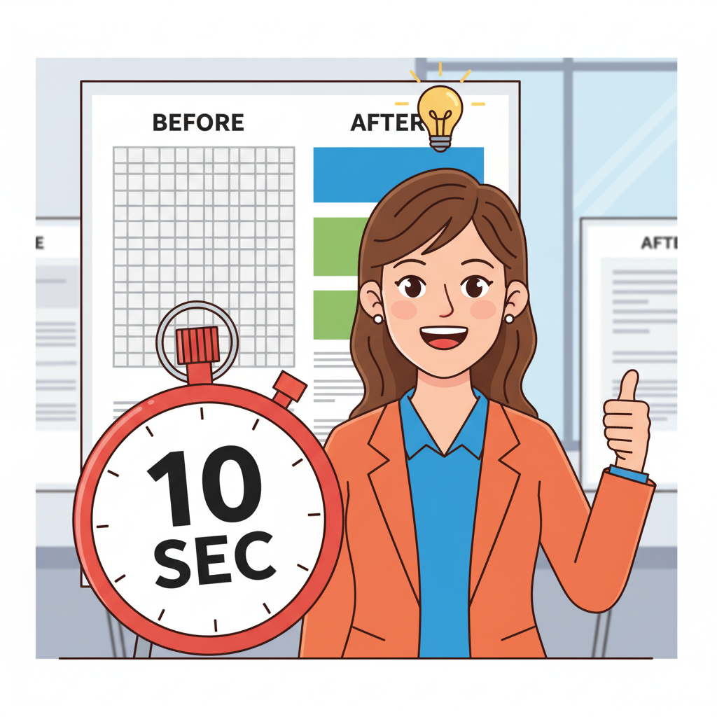
Here's what every researcher needs to understand: conference attendees follow what poster experts call the "10-10 rule" – they spend 10 seconds scanning a poster while walking by from 10 feet away. In those crucial moments, they're not reading your methodology or analyzing your statistical significance – they're asking one question: "Can I understand what this is about without working hard?" Look, I get it. When you're preparing your first conference poster at 2 AM after a grueling research schedule, hierarchy feels less important than including every fascinating detail (and yes, we've all been there with the 47-bullet-point poster).
But visual clarity creates instant academic triage for your audience, and that's not design theory – that's how conference networking works. The principle is straightforward: attendees who can grasp your contribution within 10 seconds become invested in understanding your process. That's when the real scientific conversation begins.
Research Reveals: The 10-Second Decision Window
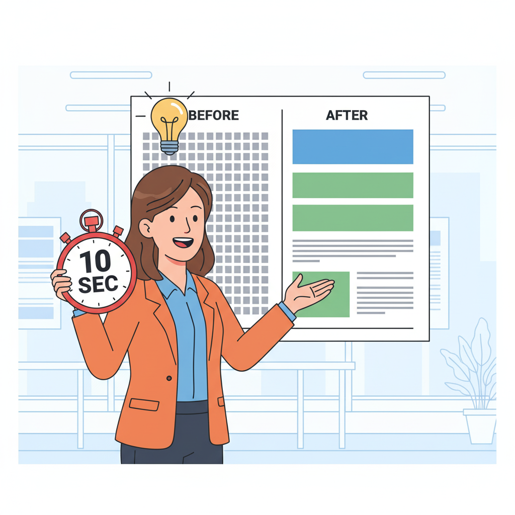
Studies of conference behavior confirm what poster halls have demonstrated for decades: attendees make rapid "stop or walk" decisions based on immediate visual comprehension. Research shows the established "10-10 rule" – conference attendees spend 10 seconds scanning posters from 10 feet away, with their eyes following predictable patterns: title first, then upper left corner, then scanning for visual elements that seem important.
The critical insight most researchers miss is understanding attention economics in academic settings. Attendees face poster-hall overwhelm, scanning dozens of displays while managing networking conversations, coffee breaks, and information fatigue. With average adult reading speeds of 238 words per minute, someone can read approximately 40 words during that crucial 10-second window – barely enough for your title and one key point.
This isn't about dumbing down your research; it's about strategic communication architecture. Your poster needs to function like a clinical diagnosis – it starts with the chief complaint (your main finding) before diving into comprehensive history. When conference attendees can identify your research question, approach, and key finding within 10 seconds, they're mentally prepared to invest deeper attention. Your poster becomes a visual abstract that earned its audience rather than demanding it.
The Visual Hierarchy Protocol: Conference-Grade Clarity
The 10-Second Rule requires ruthless content hierarchy and strategic visual discipline. Successful posters follow what we call the newspaper principle: headline (title with finding), lead story (dominant visual showing key result), and supporting details (methodology and discussion). Most posters fail because they treat every element as equally important, creating what researchers call "visual democracy" – where nothing stands out because everything competes for attention.
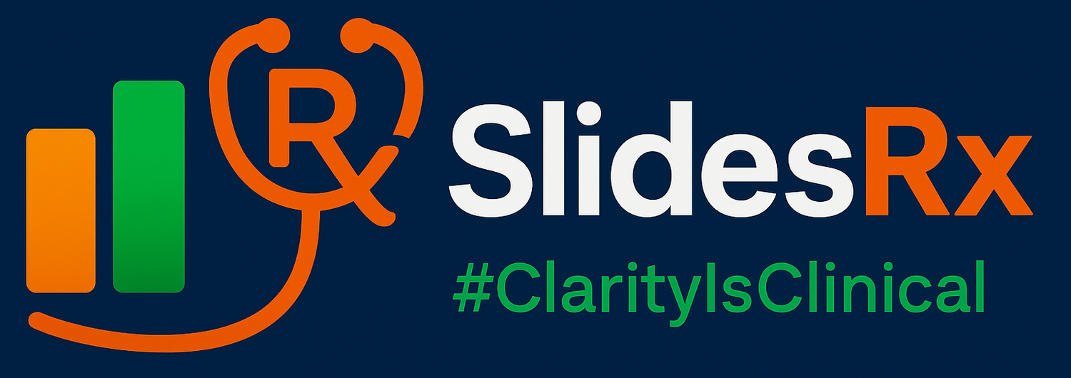
Your title must communicate your finding, not just your topic. Instead of "Analysis of Antibiotic Resistance Patterns," try "New Protocol Reduces Hospital Antibiotic Resistance by 34%." This transformation immediately tells attendees whether your research addresses their interests. Supporting this, you need one dominant visual element – a compelling graph, striking before/after comparison, or clear process diagram that reinforces your main message without requiring detailed analysis.
Consider poster layout like emergency department signage: "EMERGENCY" appears in massive letters, "Registration" appears medium-sized, and "Visiting hours 8am-8pm" appears smallest. This size progression allows instant information processing even under stress. Your research deserves identical systematic thinking – primary findings get headline treatment, methodology gets supporting placement, and acknowledgments get appropriate but subordinate positioning. Clarity isn't optional – it's clinical.
Implementing the Conference Floor Strategy: From Chaos to Academic Clarity
Most researchers unconsciously create comprehensive documentation when they should be creating strategic communication. The transformation happens when you design from the audience's perspective rather than the presenter's need to include everything. Professional posters follow the "white space principle" – empty space isn't wasted space, it's breathing room that allows your key messages to dominate visual attention.
Think of poster sessions like academic speed dating – attendees scan for research that addresses their specific interests while managing multiple competing priorities. High contrast becomes essential: black text on white or pale backgrounds performs best under conference lighting conditions, which often include overhead fluorescents, natural light, and shadows from passing colleagues. Your poster needs to survive these imperfect conditions while maintaining readability from various angles and distances.
The breakthrough insight: memorable posters earn their audience through immediate clarity, then reward deeper investigation with compelling details. When your research survives the 10-second evaluation and converts browsers into engaged discussants, you've mastered conference communication. The goal isn't perfect academic documentation; it's optimal knowledge transfer that creates opportunities for meaningful scientific dialogue extending far beyond the poster session.

Quick Takeaways
Conference attendees follow the "10-10 rule" – 10 seconds scanning from 10 feet away determines engagement
Design hierarchy like newspaper: title with finding, dominant visual showing key result, supporting details
Average reading speed allows 40 words maximum during 10-second window – choose them strategically
White space isn't empty – it's breathing room that prevents visual competition between elements
High contrast essential: black text on white/pale backgrounds survives conference lighting conditions
Title must communicate findings, not just topics – "Results achieved" beats "Study conducted"
One dominant visual should immediately demonstrate key result without requiring analysis
Design from audience perspective (rapid scanning) not researcher perspective (comprehensive documentation)
Success formula: 10-second clarity earns 10-minute conversations about methodology and implications
Conclusion
The 10-Second Rule transforms poster design from academic documentation to strategic communication. When your research earns attention through immediate clarity, you create opportunities for meaningful scientific dialogue that extends far beyond the conference floor and builds the professional networks that advance careers.
Challenge
Apply the 10-Second Rule to your current poster or next conference submission. Can a colleague identify your research question, approach, and key finding within 10 seconds of viewing? Test it on five people from outside your field – if they can't grasp your contribution immediately, redesign using hierarchy principles: finding-focused title, dominant visual, strategic white space.
Next Week Preview
Next week, we're exploring evidence-based font selection for conference posters – the typography choices and sizing protocols that ensure your 10-second success translates into sustained readability from 2-3 meters away.
Call to Action
What's your conference poster success rate? Have you experienced the 3-second walk-by, or do you consistently draw engaged audiences? Share your poster breakthrough moments and conference floor lessons – we all learn from each other's academic presentation experiences.
