
Blog 14: Use whitespace generously—it reduces visual noise.
“Whitespace is like air: it is necessary for design to breathe.” – Wojciech Zieliński
Introduction
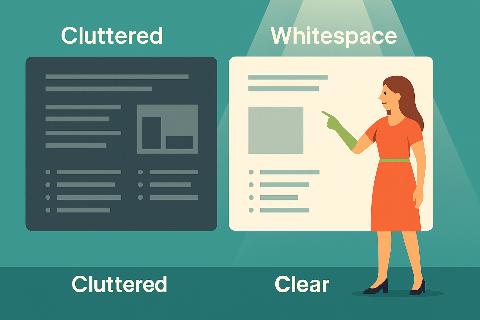
Open a cluttered slide, and the effect is immediate: your eyes dart, your brain scrambles, and your focus slips. The culprit? A lack of whitespace. Most people think of whitespace as wasted space, but in design—and especially in clinical presentations—it’s one of the most powerful tools you have. Whitespace guides the eye, reduces mental effort, and builds a sense of professionalism that earns trust. Think of it as the pause between notes in a symphony; without it, the music would be noise. When you add intentional breathing room to your slides, you give your message weight. Audiences stop scanning frantically and start absorbing calmly. This isn’t minimalism for its own sake—it’s clarity by design. In medicine, precision matters. On slides, whitespace is precision’s partner, making sure nothing distracts from the signal.
Why whitespace matters in slides
Whitespace isn’t emptiness—it’s emphasis. The space around your content highlights what matters most, drawing the eye to key text, charts, or calls to action. Without it, even strong insights get lost in a blur of text boxes and graphics competing for attention. Imagine a medical chart crammed with numbers in tiny font—technically complete, but practically unreadable. Now picture the same chart with deliberate spacing, where trends leap off the page. Your brain can relax, spot the pattern, and retain the message. Whitespace also signals professionalism: crowded slides feel rushed, but clean layouts convey authority. In clinical communication, trust is built not only by data but also by design. Whitespace tells your audience: I respect your time and want you to see what matters. It transforms your slides from busy to believable, from noise to narrative.

Practical ways to add whitespace
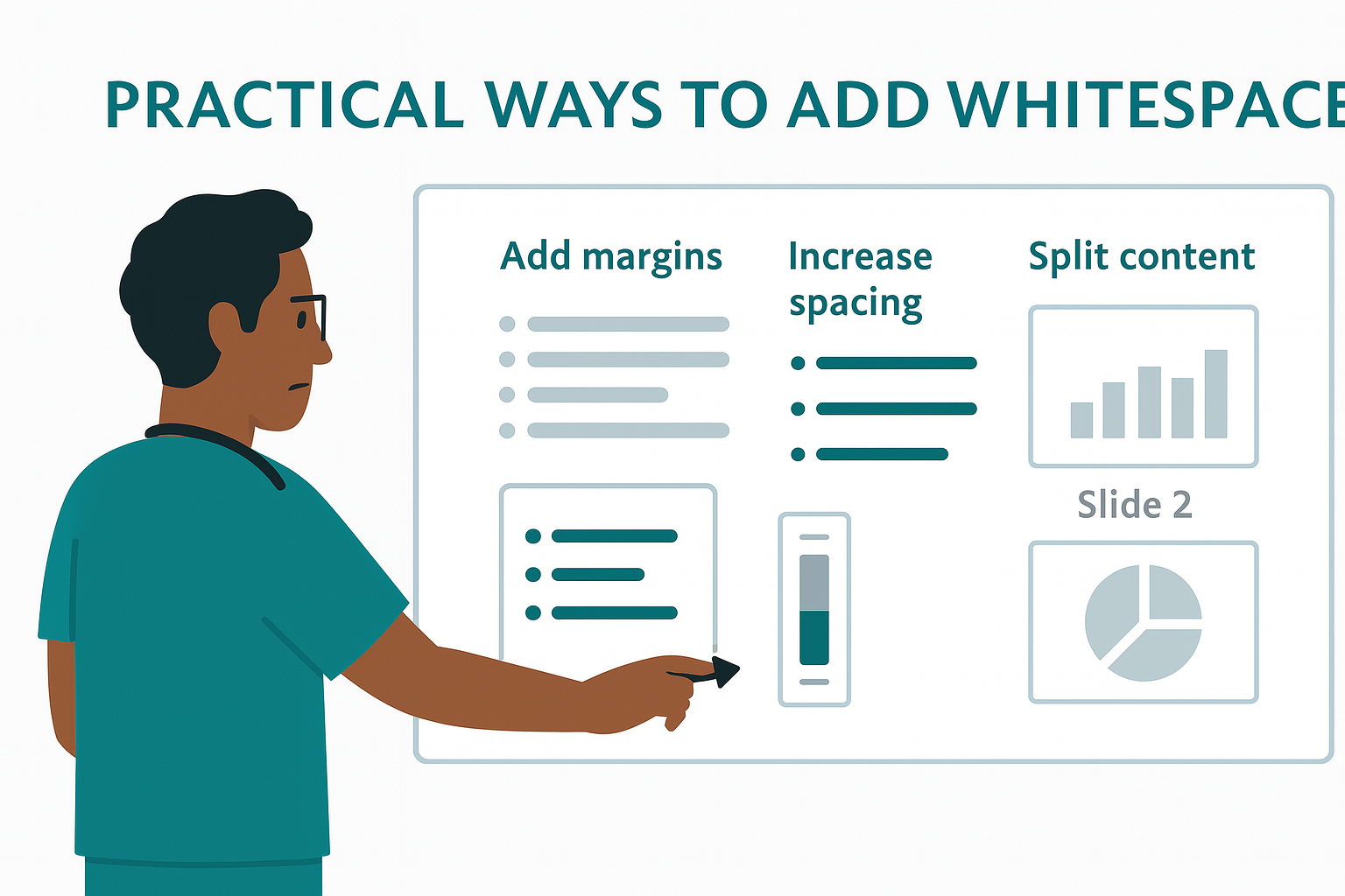
Adding whitespace doesn’t mean deleting content—it means arranging it with intention. Start by checking margins: are text boxes jammed against slide edges? Pull them back. Next, look at line spacing: bullets stacked tightly feel overwhelming, but a little extra room makes each point digestible. Use shorter lists, spread visuals across slides, and resist the urge to cram multiple charts together. Think like a magazine designer: each element deserves its own breathing room. In clinical talks, where data density is high, one finding per slide often beats three crammed together. Whitespace also extends to typography—choose consistent fonts with clear hierarchy, and avoid shrinking text to make it all fit. Every adjustment that creates space is a step toward clarity. Your slides don’t need to be packed to be powerful—they need to be paced.
The impact on audience attention
Audiences today are overloaded. Every notification, every email, every buzzing screen competes for their focus. When they walk into a talk, their attention is fragile. Cluttered slides snap that thread instantly. Whitespace, on the other hand, acts like a visual sigh of relief. It slows the pace, calms the eye, and lets your point land. In studies of design psychology, layouts with generous whitespace are consistently rated as more professional, credible, and memorable. Your audience may not consciously think, “I appreciate this spacing,” but they’ll feel it. They’ll stay with you longer, recall more, and trust your message more deeply. That’s the subtle power of whitespace: it doesn’t just make slides look better—it makes audiences listen better. And in clinical communication, being heard is half the battle.

Quick Takeaways
• Whitespace is emphasis, not emptiness.
• Crowded slides bury insights; space reveals them.
• Margins, line spacing, and slide pacing create clarity.
• One finding per slide often beats three.
• Whitespace signals professionalism and respect.
• Clear design keeps attention where it belongs: on you.
Conclusion
Whitespace is the simplest design upgrade with the biggest payoff. It shifts your slides from frantic to focused, from messy to memorable. Audiences may never thank you for using it, but they’ll reward you with attention, clarity, and trust. And in the end, that’s what clinical communication is all about.
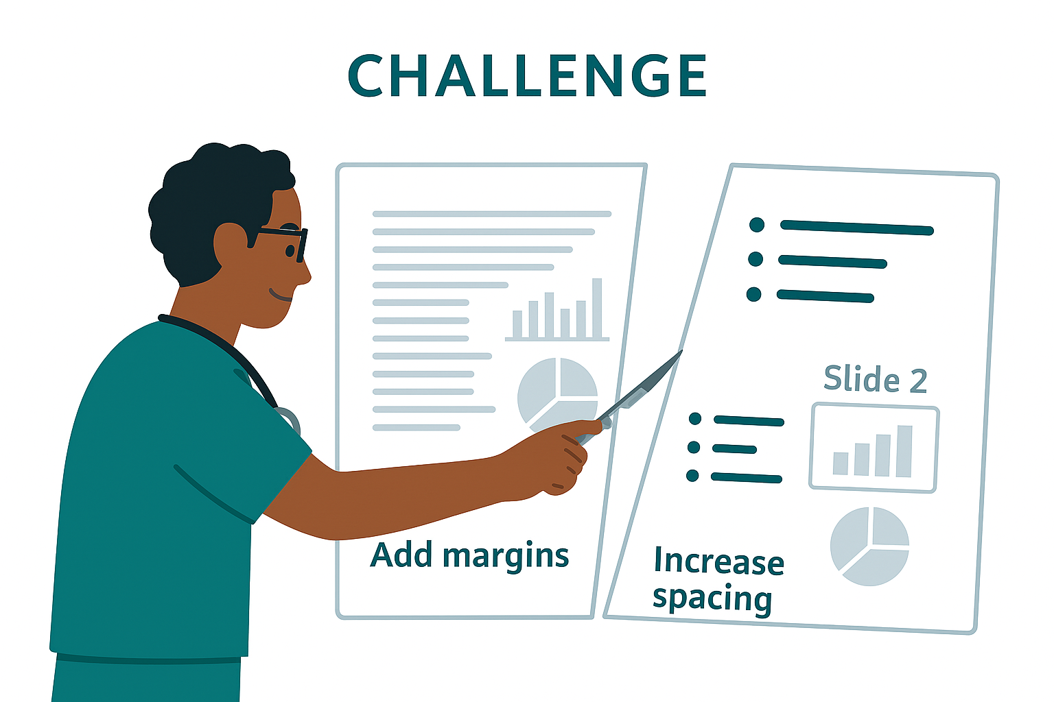
Challenge
Pick one of your busiest slides and perform whitespace surgery. Expand the margins, spread out the bullets, or split one dense slide into two clean ones. Then ask yourself: which version would you rather sit through? Your audience deserves the clearer one—and so do you.
Next Week Preview
Next week, we’ll dive into typography discipline: applying consistent fonts—Montserrat for titles and Lato for body text—to keep your slides polished and professional.
Call to Action
Where have you seen whitespace used brilliantly—or neglected completely? Share an example from your own field. Your story could inspire another presenter to trade clutter for clarity.