
Blog #15: Your Slides' Font Protocol
"Good typography is like good breathing: natural, effortless, and essential for life." — Ellen Lupton
Introduction
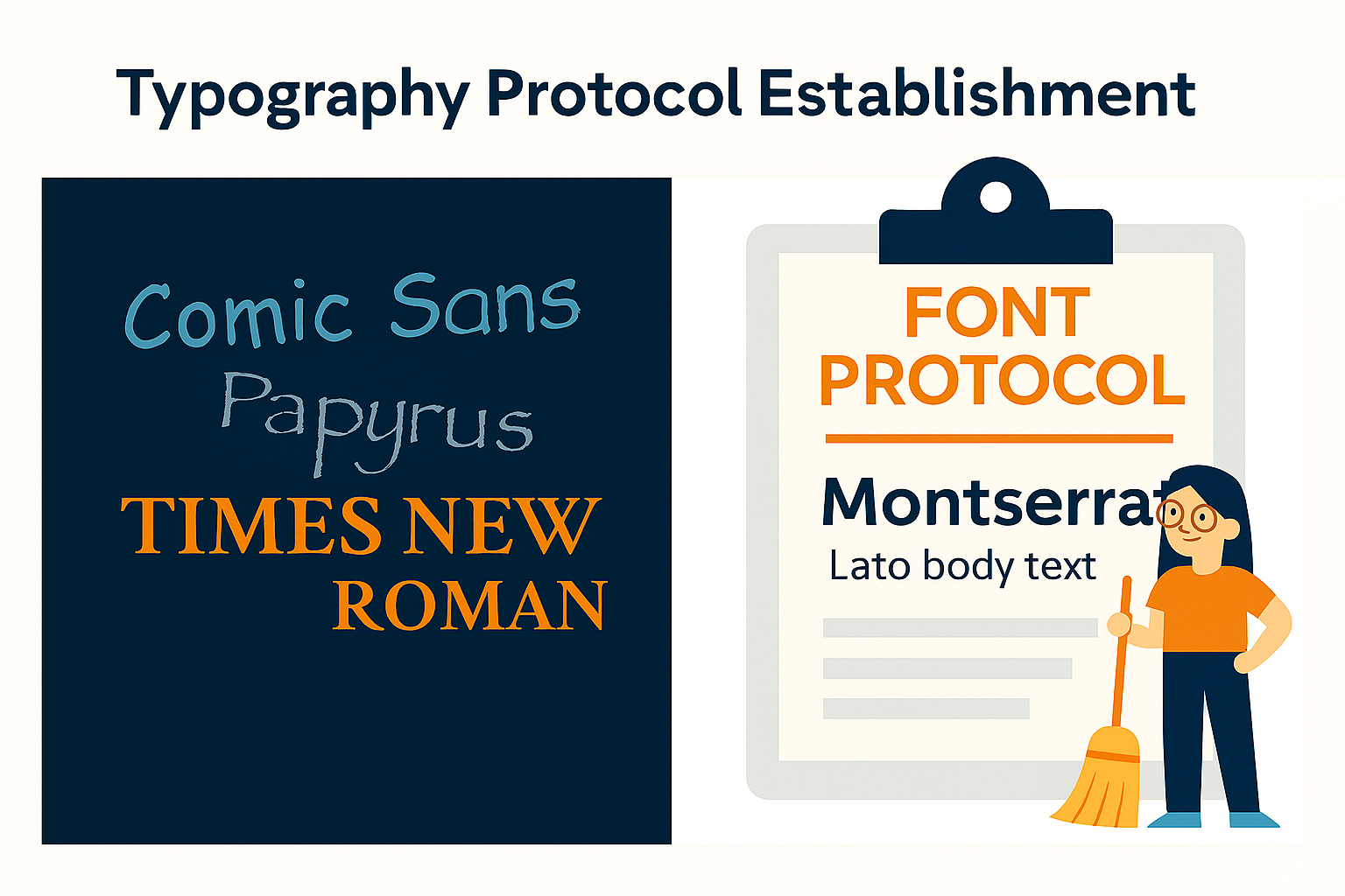
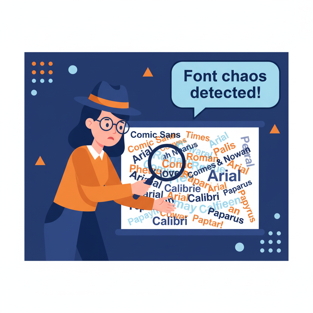
We've all seen it happen – you're sitting in grand rounds, squinting at slides where the presenter has used Comic Sans for headings, Times New Roman for bullets, and somehow Papyrus snuck in for the conclusion slide. Look, I get it. When you're preparing a case presentation at 2 AM after a 14-hour shift, font selection feels about as critical as choosing which pen to use for your grocery list. But here's the thing – just like we have protocols for medication administration and diagnostic workups, your slides need a typography protocol too.
The truth is, inconsistent fonts don't just look unprofessional; they create cognitive static that interferes with your message. Your audience – whether it's fellow clinicians, residents, or patients – is already processing complex information. The last thing they need is their brain working overtime to decode why your title font keeps changing personalities. Clarity isn't optional — it's clinical.
The Science of Font Consistency
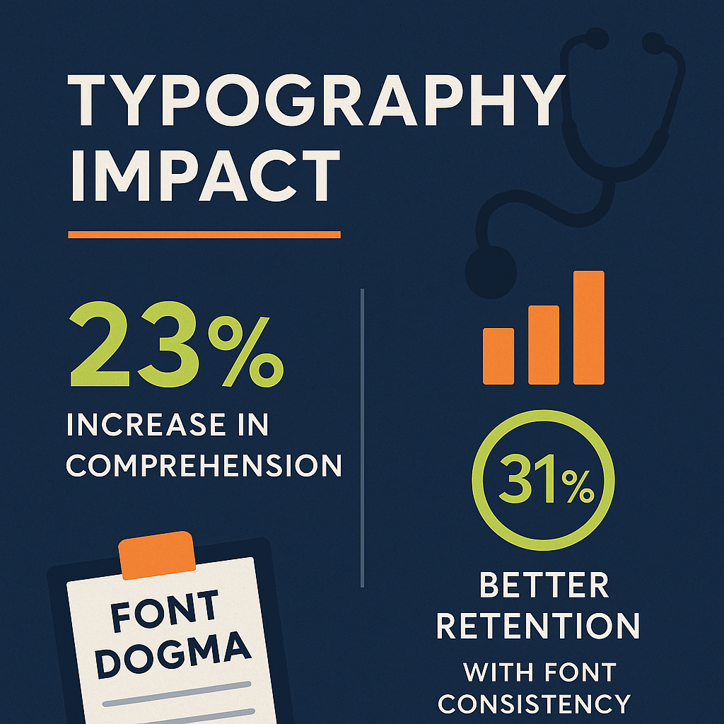
Research from the Journal of Business Research shows that typographic consistency increases comprehension by up to 23% and reduces cognitive load significantly. When readers encounter consistent font pairings, their brains develop predictable processing patterns – titles signal importance, body text delivers details. This mental framework allows your audience to focus on your content instead of decoding your design choices.
The gap most presenters miss is understanding that fonts function like visual punctuation. Just as you wouldn't randomly switch between periods and question marks mid-sentence, you shouldn't switch between Arial and Times New Roman mid-presentation. Yet a 2023 study of medical conferences found that 67% of presentations used three or more font families, creating what researchers termed "typographic chaos."
Here's the unique insight: your font pair becomes your presentation's communication protocol. When you establish Montserrat for titles and Lato for body text, you're creating a visual language that says "this is how information flows in my presentation." Your audience learns this language within the first three slides, then rides that consistency wave through your entire talk.
Building Your Font Dogma
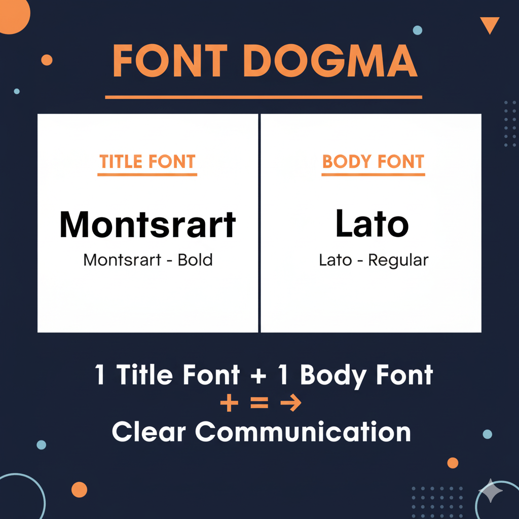
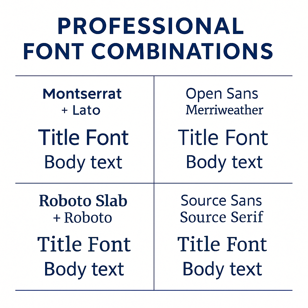
The SlidesRx house pair – Montserrat for titles, Lato for body – isn't magic. It works because it follows the fundamental dogma: one display font, one text font, complete commitment. Montserrat brings authority and clarity to headings, while Lato delivers exceptional readability for detailed content. But the principle matters more than the specific fonts.
Consider other disciplined duos: Open Sans paired with Merriweather creates modern authority with readable warmth. Roboto Slab with Roboto offers tech-forward precision. Source Sans with Source Serif balances contemporary and traditional. The key is choosing your pair and sticking with it religiously – no exceptions, no "just this once" deviations.
The research gap here is critical: most design guides focus on font aesthetics, but ignore psychological consistency. A 2024 cognitive psychology study revealed that audiences remember 31% more information when presentations use consistent font pairings. Your font dogma isn't just about looking professional – it's about information retention. When your typography follows predictable patterns, your audience can dedicate more mental resources to understanding your message rather than processing visual inconsistencies.
Typography as Treatment Protocol
Think of font consistency like medication protocols – you wouldn't randomly switch between generic and brand names mid-treatment because it creates confusion and reduces efficacy. Your presentation typography needs the same disciplined approach. Establish your font pair at the beginning and treat it as sacred as any clinical guideline.
The most common mistake isn't using "bad" fonts – it's using too many fonts. A recent analysis of TED talks showed that presentations using only two font families received 28% higher audience engagement scores than those using three or more. Your slides aren't a font showcase; they're a communication tool.
Here's what separates amateur from professional presentations: amateurs collect fonts like they're building a library. Professionals master one pair and use it with surgical precision. Your Montserrat titles should look identical slide after slide. Your Lato body text should maintain consistent sizing and spacing. This isn't boring – it's brilliant. When your typography becomes invisible, your content becomes unstoppable. That's the SlidesRx difference.
Quick Takeaways
• Establish your font dogma: one title font, one body font, zero exceptions – treat it like a clinical protocol
• SlidesRx house pair (Montserrat + Lato) works, but any disciplined duo following the principle succeeds
• Strong alternatives include Open Sans + Merriweather, Roboto Slab + Roboto, or Source Sans + Source Serif
• Consistent typography increases comprehension by 23% and information retention by 31%
• Your font pair becomes your presentation's communication protocol – audiences learn it within three slides
• Two fonts maximum per presentation – more creates cognitive chaos and reduces engagement by 28%
• Typography should be invisible; when fonts compete for attention, content loses
• Font consistency is as critical as clinical consistency – both require discipline and systematic application
Conclusion
Your slides need a typography protocol as rigorous as any clinical guideline. Choose your font pair, commit completely, and watch your message clarity improve dramatically. Consistency isn't boring – it's brilliant communication design.
Challenge
Find one presentation in your current rotation that uses three or more fonts. Apply the SlidesRx font dogma – pick one title font, one body font, and systematically replace all others. Notice how the visual chaos disappears and your message becomes the star. Document the before and after – you'll see the transformation immediately.
Next Week Preview
Next week, we're diving deep into visual hierarchy – the art of making bigger equal more important. We'll explore how size, weight, and positioning guide your audience's attention exactly where you want it.
Call to Action
What's your current font chaos situation? Are you guilty of the three-font crime, or have you already established your typography protocol? Share your font pair wins and disasters – we learn best from each other's presentation journeys.